Vocabee
My Role: UX Research & Design
Tools: Pen & Paper / Marvel
Timeline: Feb-Mar 2022
A mobile app that empowers people to learn (and remember) new vocabulary.
The Background
As part of the Introduction to UX Design course with CareerFoundry, I was tasked with designing a mobile app that empowers people to learn new vocabulary. As an ESL teacher, I was immediately intrigued by this project and eager to explore innovative ways to cater to users’ language learning needs.
Getting Inspired
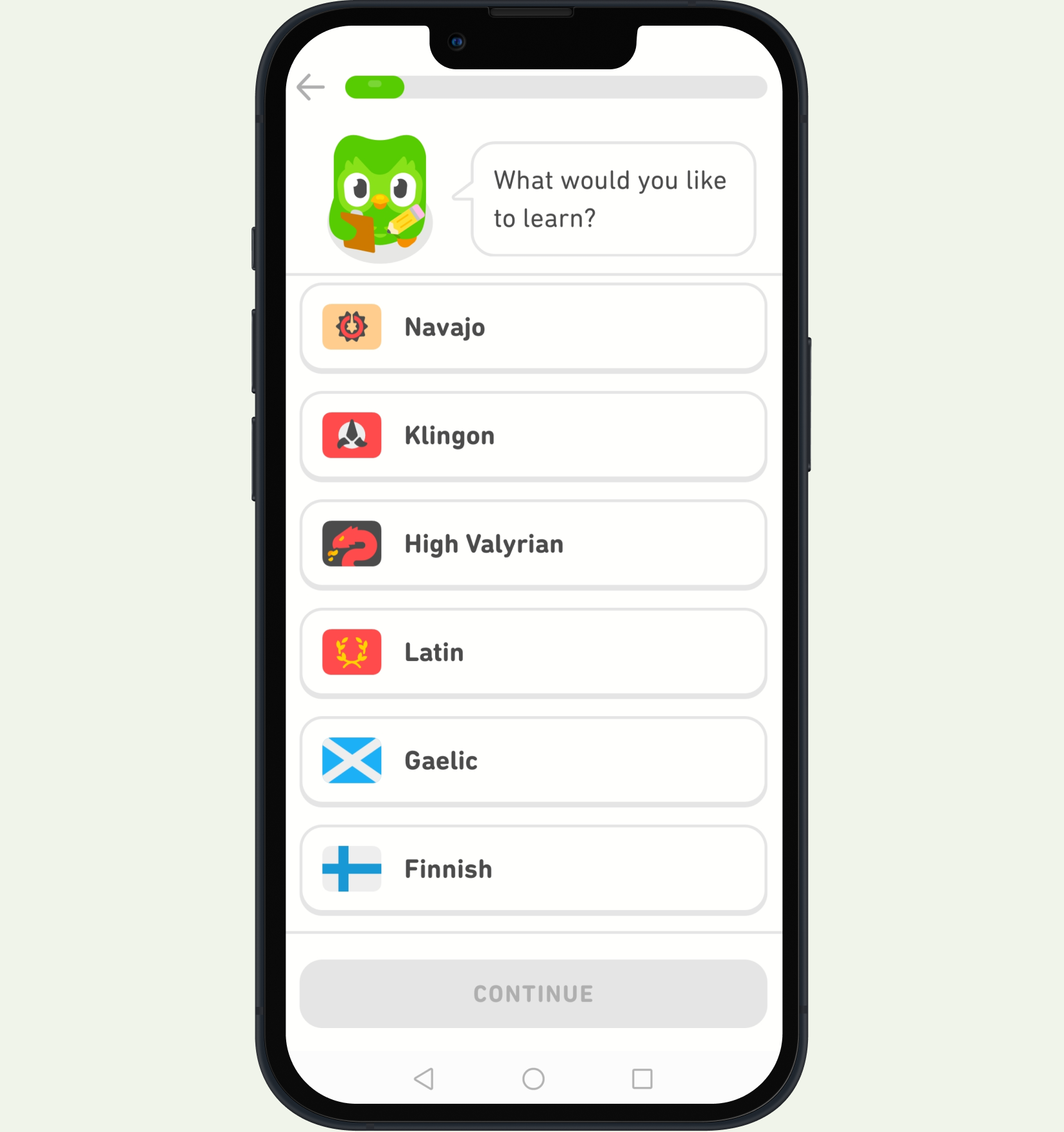
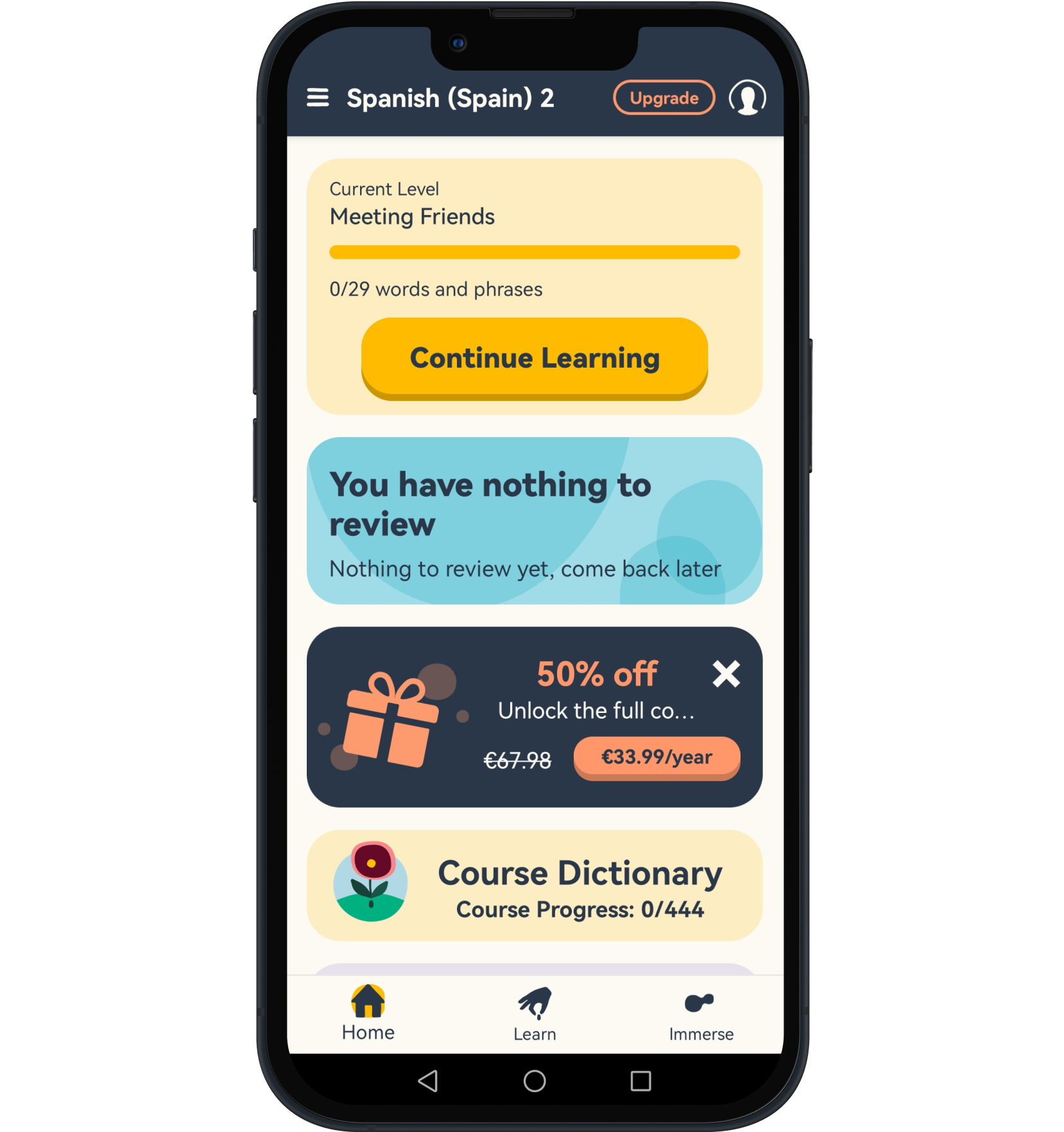
I began with a competitor analysis. I was spoiled for choice as the market is flooded with vocabulary and language apps. To keep things simple, I went with two apps that I was familiar with and one that was brand new to me. I analyzed the experience of using these apps and evaluated both positive and negative points while specifically focusing on the onboarding experience, menu and navigation, and the learning experience. I summarized my findings in a pros and cons list for each one. Here are some of the findings:
Duolingo
Pros:
- The app motivates the user through gamification.
- Elements of gamification include streaks and rewards.
- Achievable goals motivate learners and instill confidence.
- Positive reinforcement from characters delights and encourages the user.
- Correct answers are understood with a ding sound which could create a Pavlovian response in the user.
- Core features of the app are available to the user without having to create an account.
Cons:
- When an answer is incorrect, the user is given the correct answer, rather than a second try.
- Some of the voices are irritating.
- When words are chosen quickly to create a sentence, the audio cannot keep up.
- The settings gear button is not intuitively placed and might be better on the homescreen.
- Not all icons are suggestive of their functions.
Memrise
Pros:
- Quick, concise value proposition motivates before logging in.
- Two simple button choices to log in or set up a new account.
- The user can sign in multiple ways (Facebook, Google or Email).
- Setup is quick and easy, prompting the user to choose the desired language and their level.
Cons:
- The user must create an account to use the app.
- Subscription ads are part of the onboarding before the user has the chance to try the app.
- Huge subscription button in the middle of the first content screen distracts from the course itself.
- Every time the user exits the learning session, the subscription ad or a video ad is shown.
- Clunky UI with large, distracting buttons, including one to “unlock the full experience,” placed on top of the course navigation screen are distracting to the user.
Duocards

Pros:
- Cute “Memo” character walks the user through the onboarding.
- Guidance and instructions are simple and clear.
- Encouraging words and adorable suggestions delight the user before even starting to learn.
- Icons are intuitive and take the user to the expected destination.
- Options are limited, keeping things simple.
- The user has many options for learning, including creating flashcards, watching videos and reading articles.
- Flashcards can be organized into categories.
- As well as a daily streak feature to motivate the user, there is a flame feature which helps the user track learning progress.
- There are options within the flashcards that allow the user to disable certain features like sound.
- The user can save words from videos and articles into their flashcard collection.
Cons:
- The user is forced to look at subscription options rather than being given the choice to ignore or see them later.
Once the words on the flashcards are “known,” the user must wait a few minutes to continue practicing them.
Getting to know language app users
Once I had a clearer idea of some of the best features of existing learning apps, I began user research to better understand what users might want from my app. I spoke with four individuals who were either currently using language learning apps, or had done in the past. I wanted to discover as much as I could about their experiences.
Research Goals
- To learn about pain points they have or have had with learning apps in the past
- To discover features and elements they enjoyed the most
- To find out what kept them motivated while learning a language
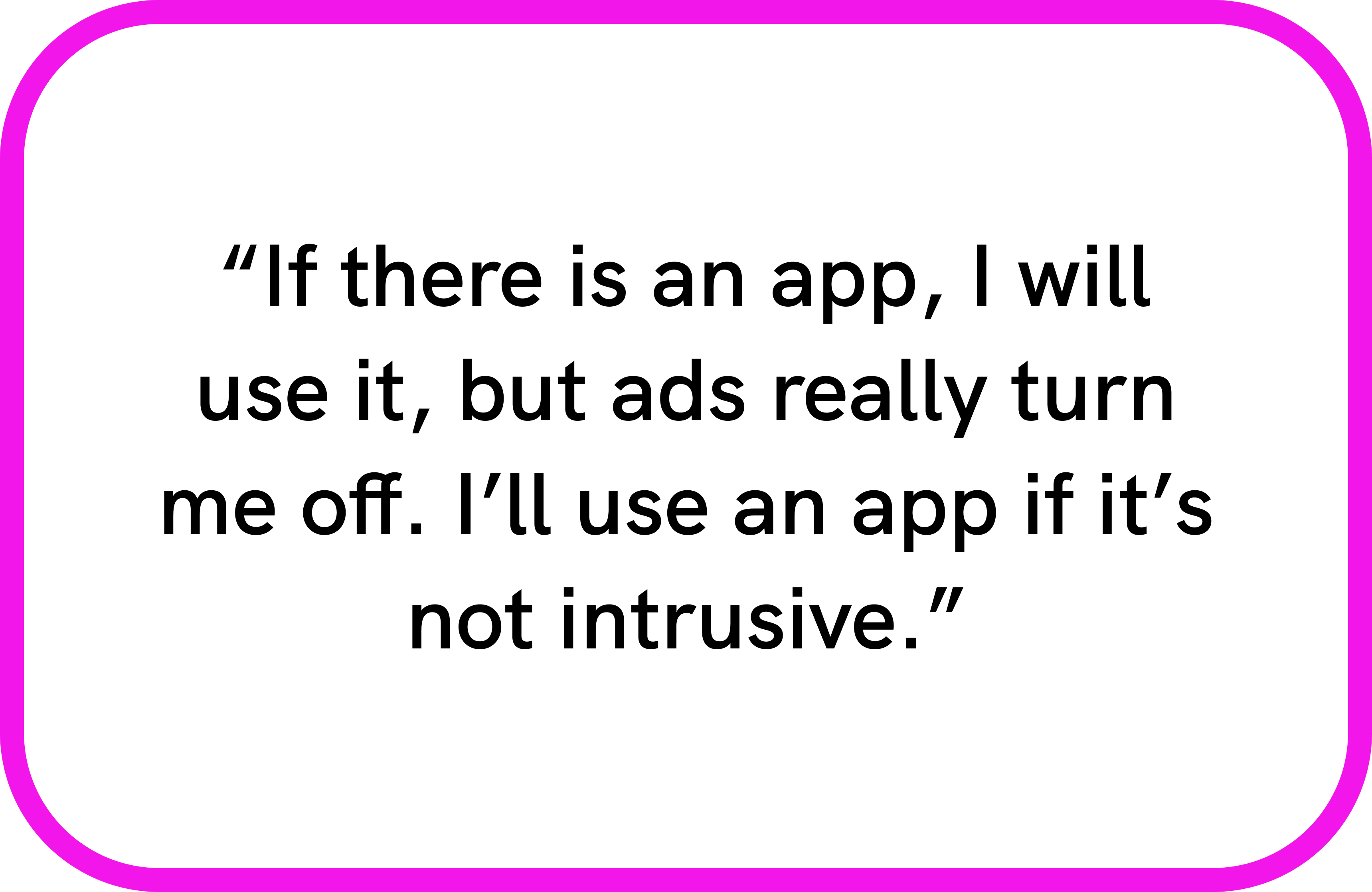
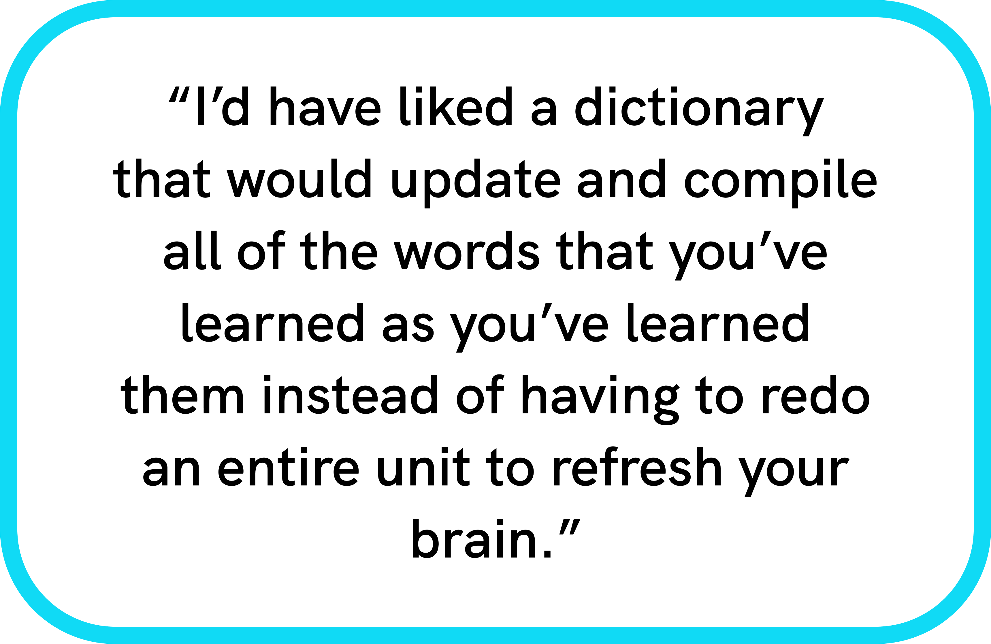
Key Findings
- People don’t have a lot of time to spend on language apps but were willing to devote up to 30 mins a day.
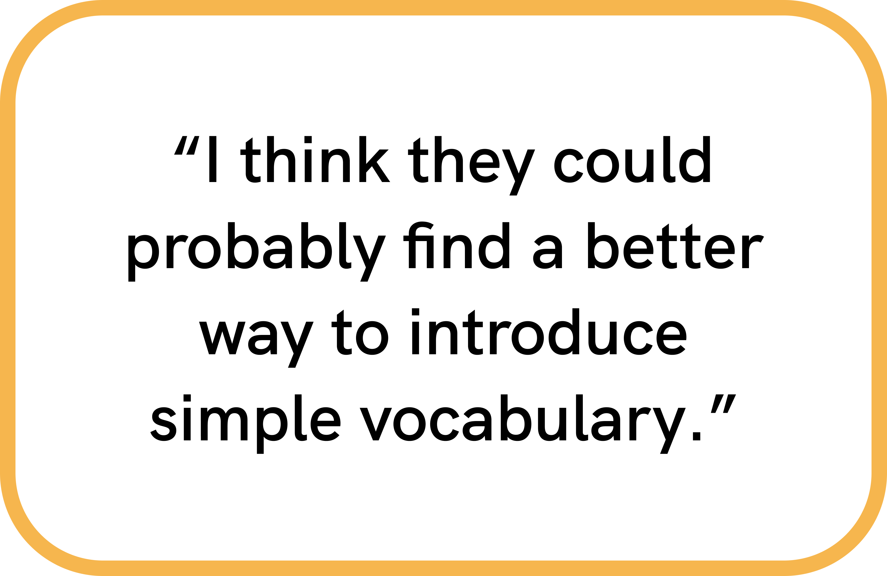
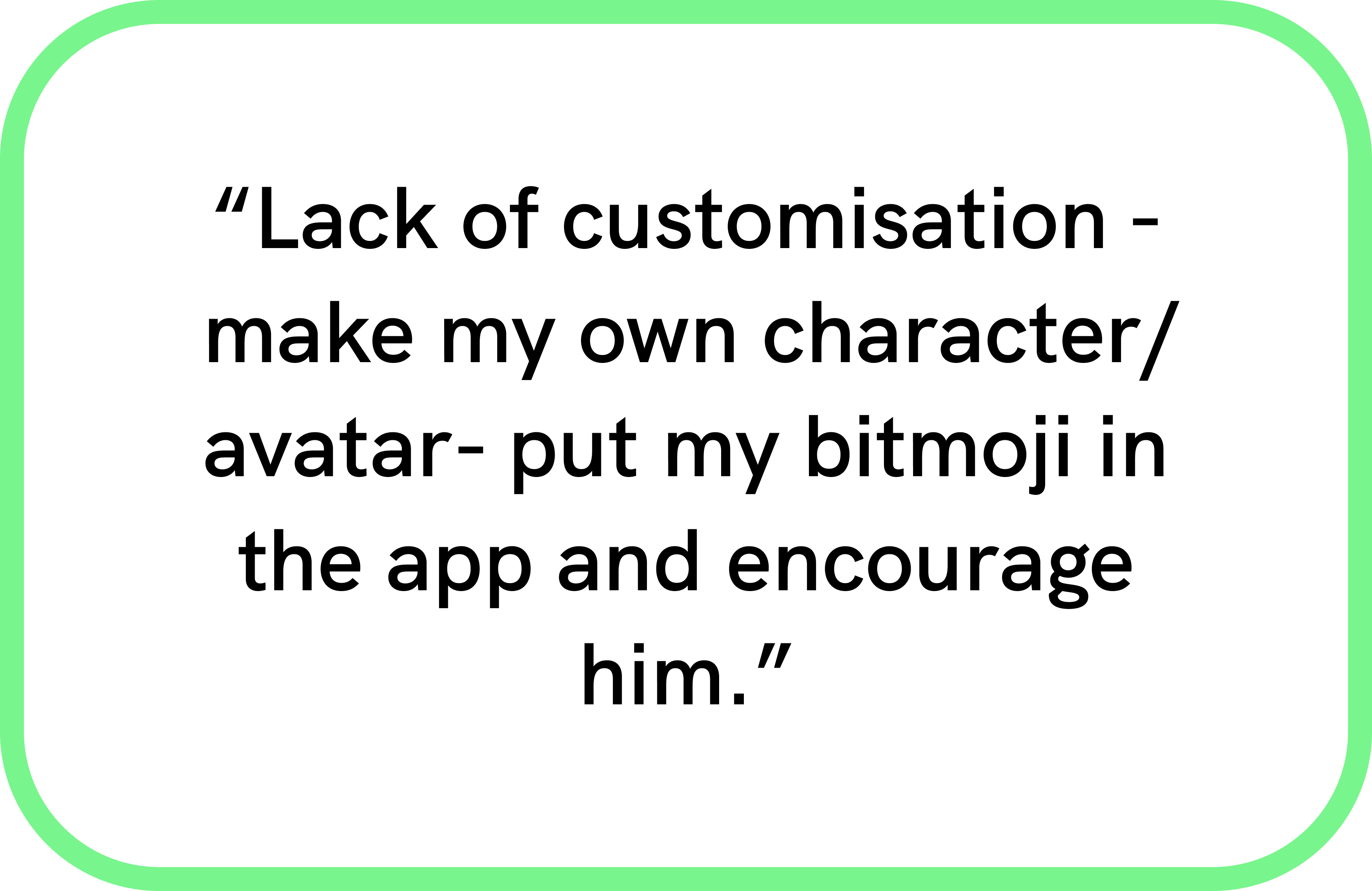
- Pain points varied. Some mentioned a lack of customization.
- The majority said they were visual learners and liked learning new words with pictures.
- Everyone enjoyed the gamification aspect of apps they’d previously used.
- The feeling of success motivated people to continue
Identifying the Problem
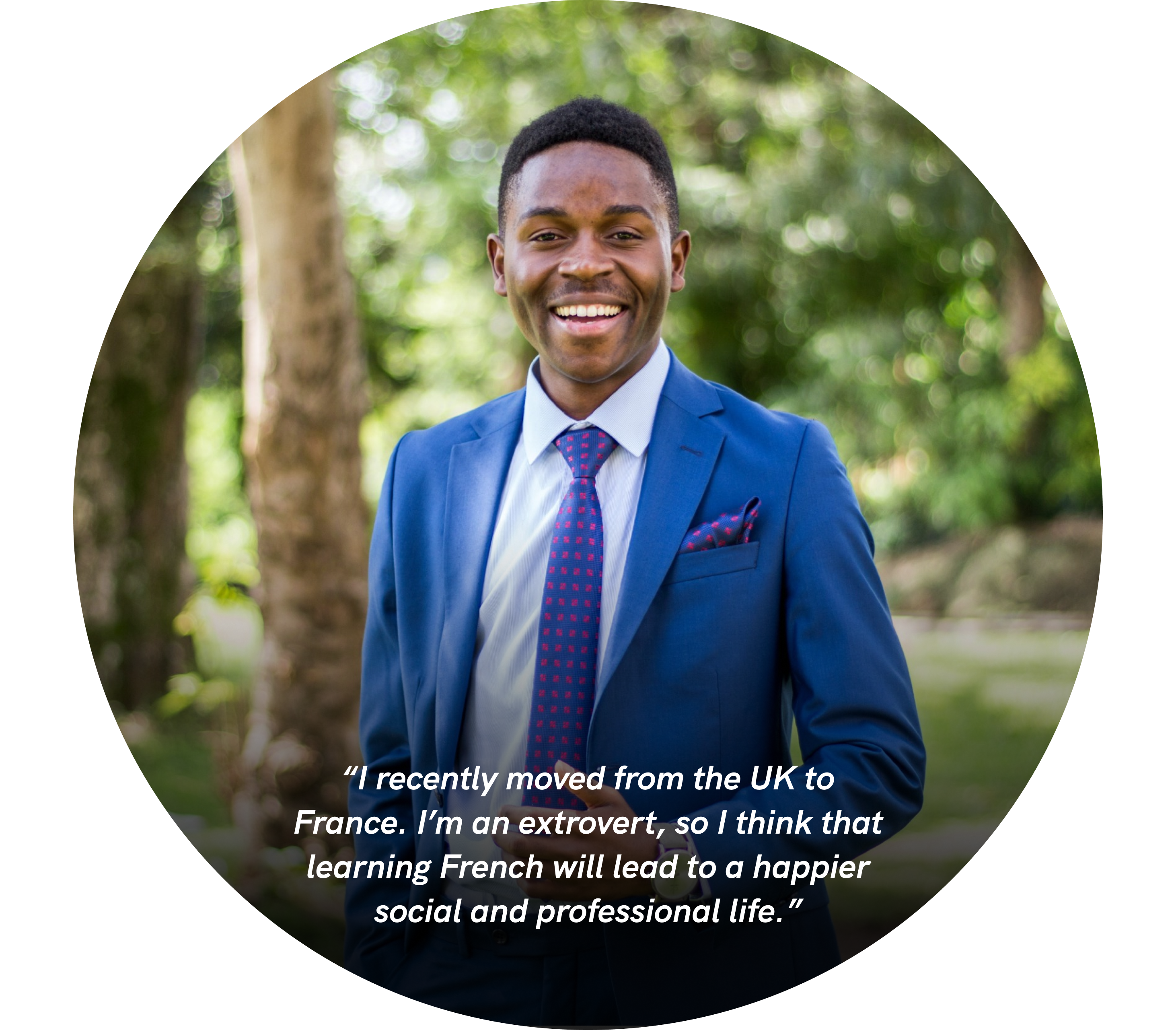
Luca Jones: 32 year-old Londoner who speaks English and Italian and who has recently moved to France. Luca is an online therapist who has decided to work remotely for a while to get a change of scene. Eventually wants to settle down and open a private practice.
Needs:
- Wants to begin learning French to more quickly assimilate to his new surroundings.
- Wants to speak French so as to join a cycling group.
- Is easily distracted by social media, so needs an app that will keep him motivated.
- Wants to commit to learning long term with the ultimate goal of opening a private practice in Toulouse.
Luca's Problem:
Luca, a busy individual looking to learn French and assimilate into a new city without attending a language school, Is looking for an app that will both motivate him to continue and keep him consistently engaged while learning. Luca's goal is to progress in his career and connect with local people in Toulouse.
My Goal
To develop a language learning platform that offers interactive and enjoyable language lessons, customizability, gamified elements, and opportunities for social interaction that will lead to Luca's successful assimilation and career advancement.
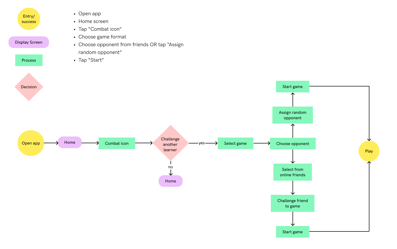
Conceptualizing the Flow
Now that I had brought my users to life through Luca, I began visualizing the tasks he would complete while using Vocabee. I developed a couple of user flows for two of the most important tasks: Saving learned vocabulary words to a bank and challenging another user to a game.
Save learned words to bank

Challenge another user to a game
My First Wireframes
From my user flows, I drew wireframes which I would then prototype and test with real users. I used Marvel to prototype my sketches and tested four tasks with four participants.
Example flow: Challenge an opponent to a game

Before testing my design, I outlined my main research goals. I wanted to discover the following:
- How intuitive were the flows?
- Would users find the app engaging and motivating?
- Would the tests uncover anything missing that users expected to find in a language learning app?
The Tests
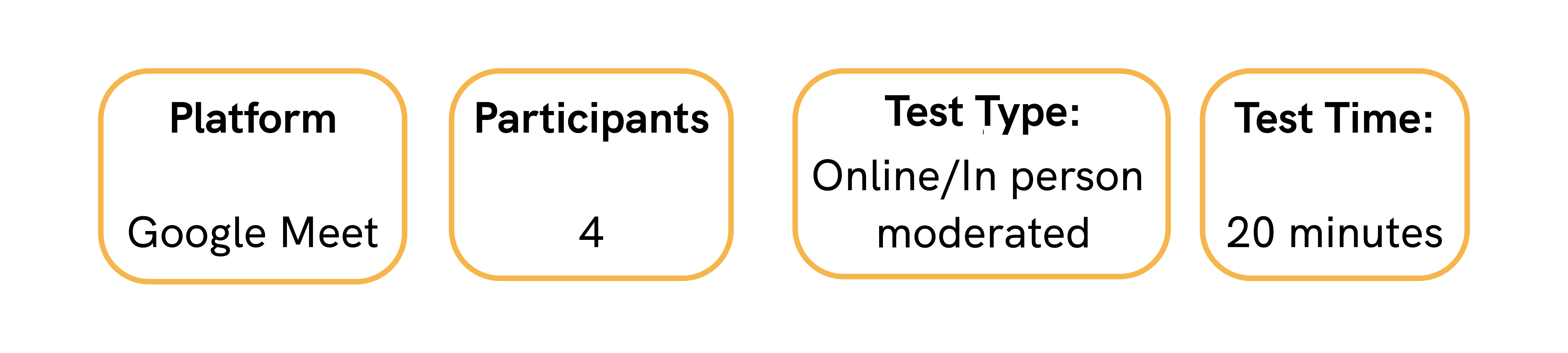
The Tasks
- Go through onboarding
- Complete a lesson then save words to a bank with images
- Challenge another player to a game
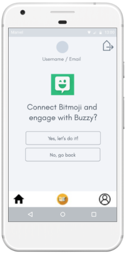
- Connect your Bitmoji to the app
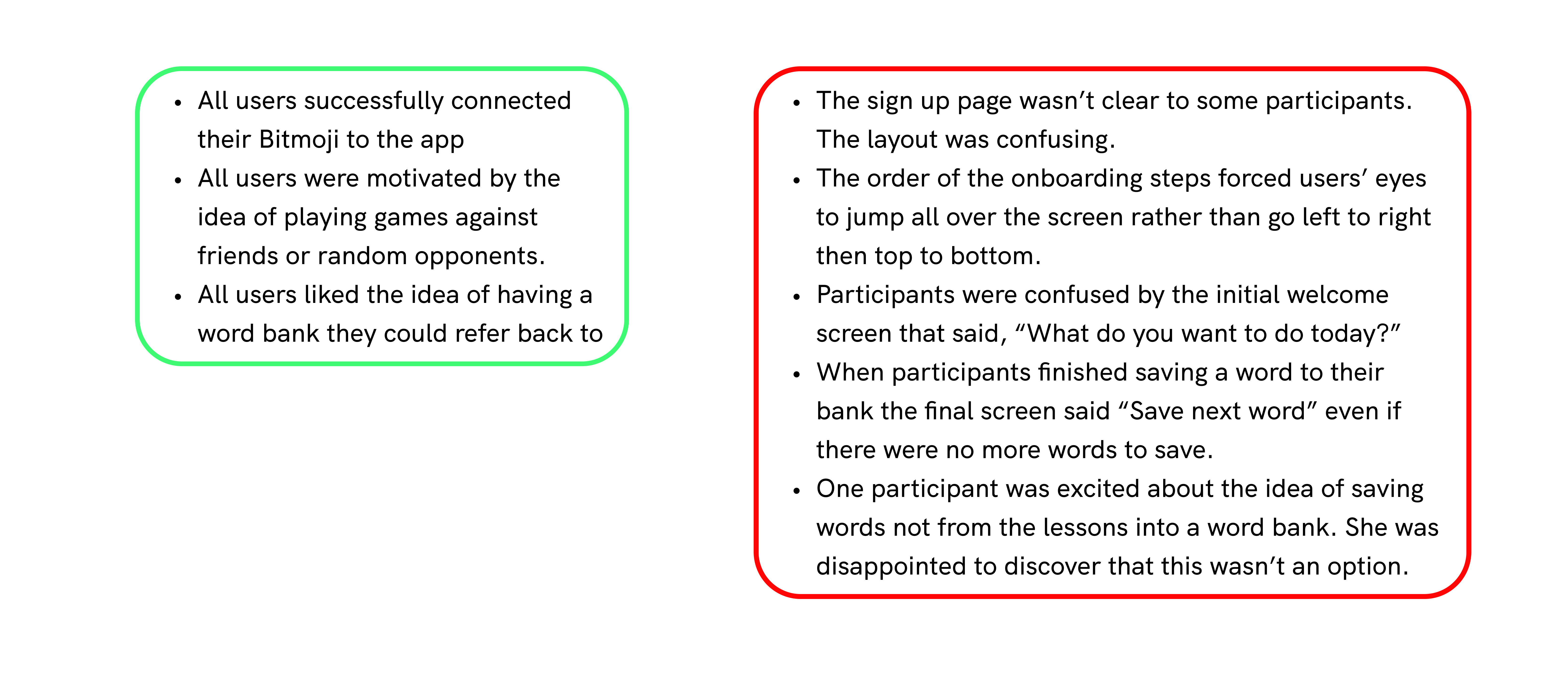
I watched as my participants made their way through the various tasks I had assigned to them. It was becoming apparent how valuable usability testing was and I was intrigued to see the different ways people interpreted my app.
What worked Things to improve
Upping the Fidelity
Rather than sketch new wireframes, I decided to incorporate the changes I would make into mid-fidelity wireframes, also created on Marvel. There were many iterations I wanted to make including improving the layout on the signup page, finalizing the saving a word flow and adding an option to save your own words to your bank.
Updates to the Sign up page
By changing the wording on the 'Next' button to 'Continue', and by placing it with the form fields rather than under the alternative ways of signing up (Google, FB), this screen became more intuitive.

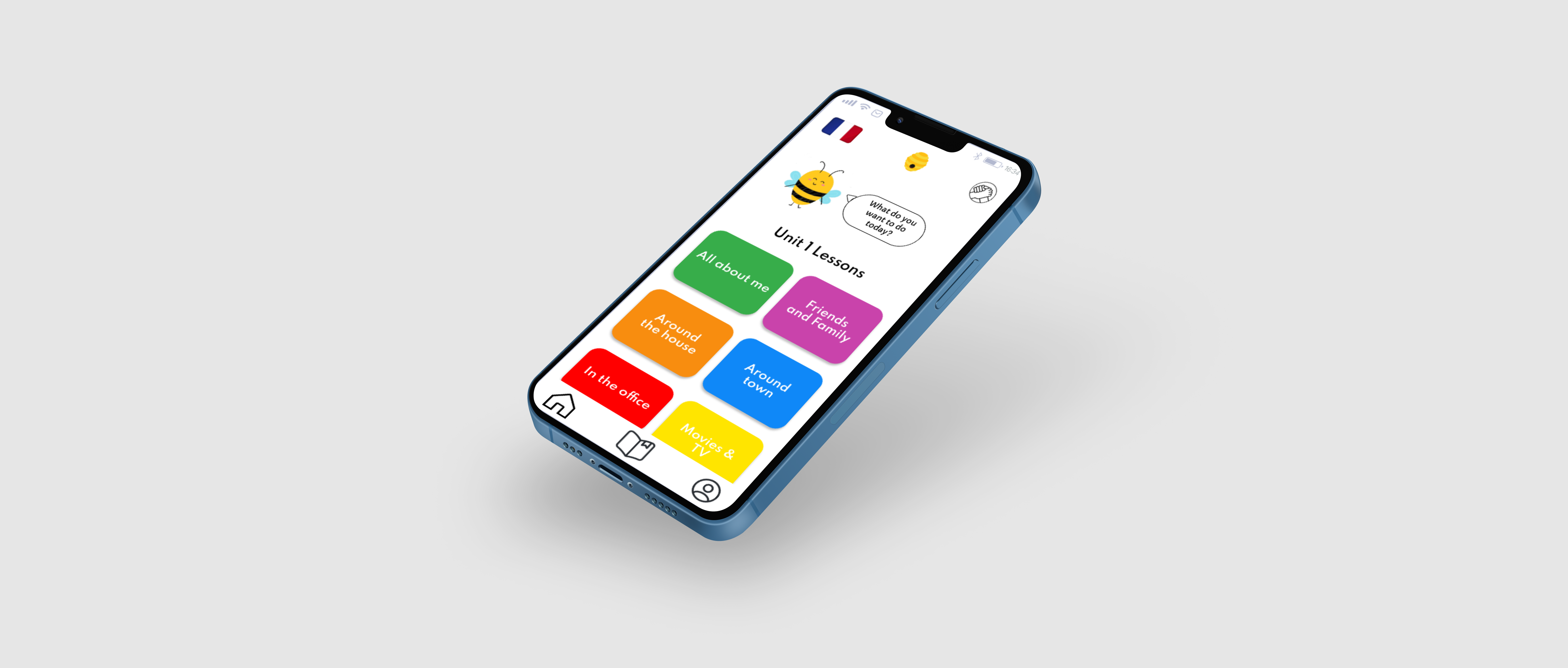
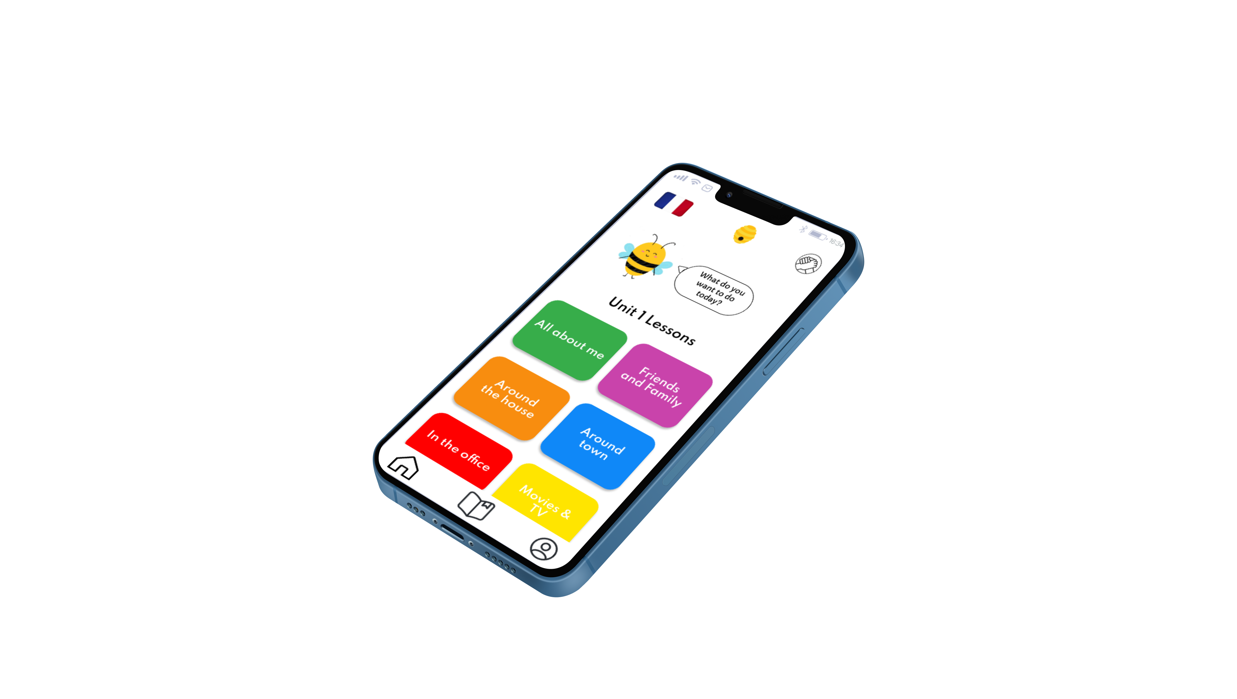
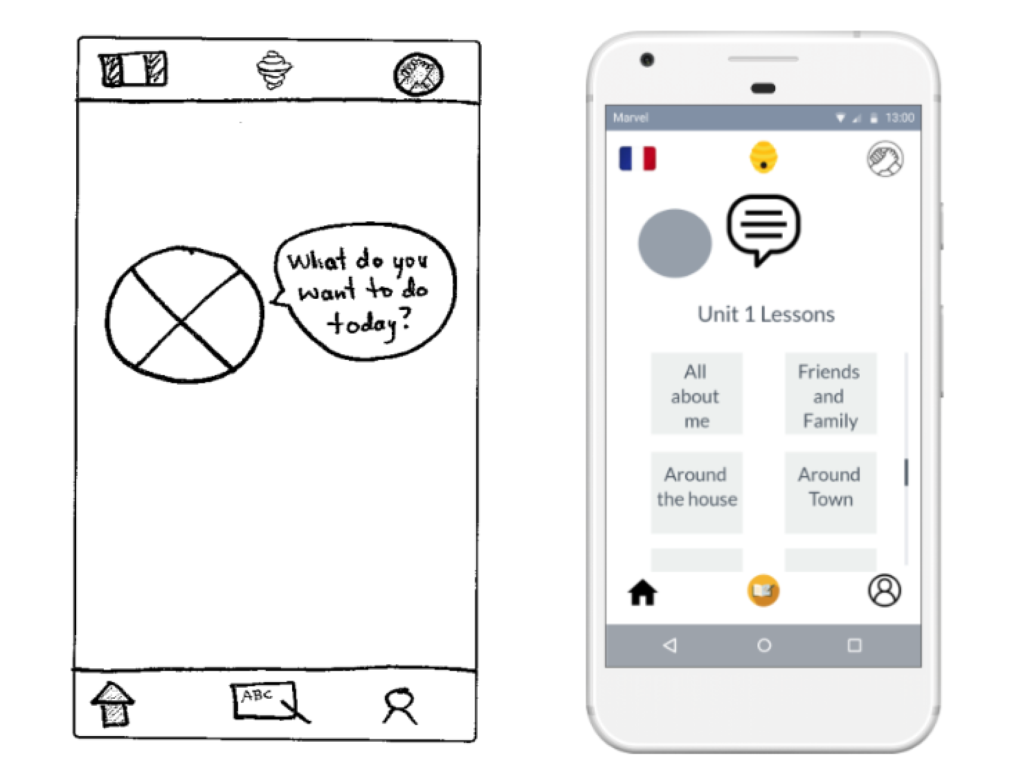
Updates to the Home screen
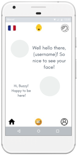
Users expressed confusion over this initial screen where Buzzy (the Vocabee mascot) asks what the user wants to do. Therefore I combined this with the home screen where the user can access all icons and lessons.
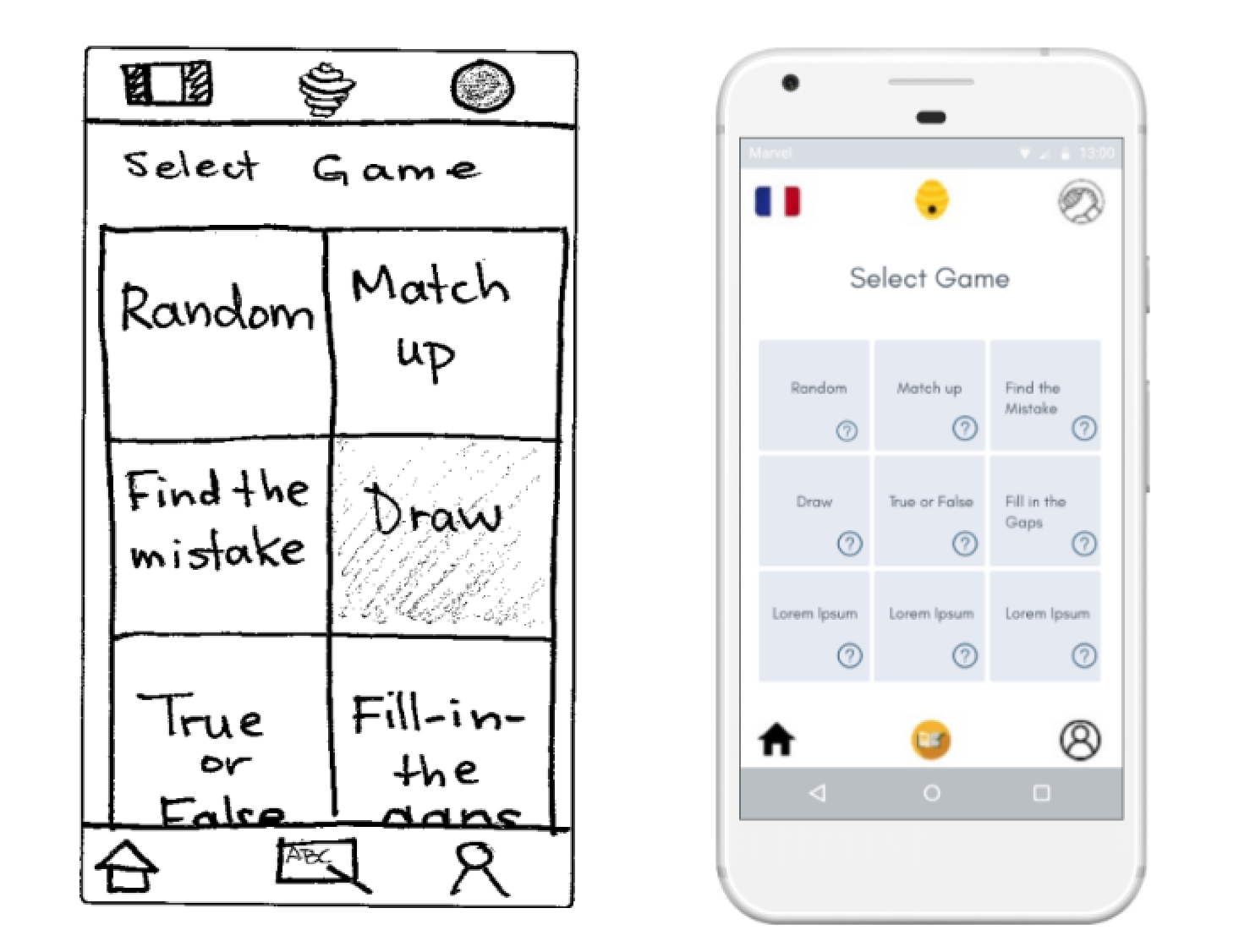
Updates to the game screen
I added info buttons to the game tabs so that users can check game instructions before selecting a game. This prevents a lot of back and forth between screens because the user no longer needs to select a game and be taken to the next screen to find out how to play.
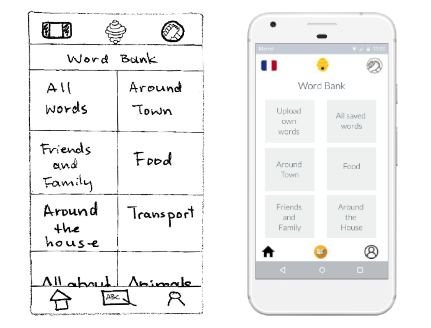
Updates to the word bank
Some test participants expressed a desire to include words learned outside of the app in their word bank. The new screen now reflects this option.
More Testing
After prototyping my new, mid-fidelity screens, I took Vocabee for a second round of tests with the two of the same participants and two new ones. All of the tests were moderated in-person tests and I specifically wanted to observe their behavior on the updated screens. My key findings were as follows:
- 100% of participants successfully signed up to the app.
- One user was trying to zoom in when reading the game instructions
- Most users were excited by the idea of adding their own words and photos to the bank; they liked the personal element it added.
Final Steps
As this was a short, introductory project, the scope did not include high-fidelity screens or developing the UI of the app. However, I decided to add a few more screens to make Vocabee feel more complete, including an accessibility screen where users can change the font size, adjust sounds, adjust color contrast and add subtitles to videos.

Thank you for taking the time to read the story of Vocabee.
Selected Works