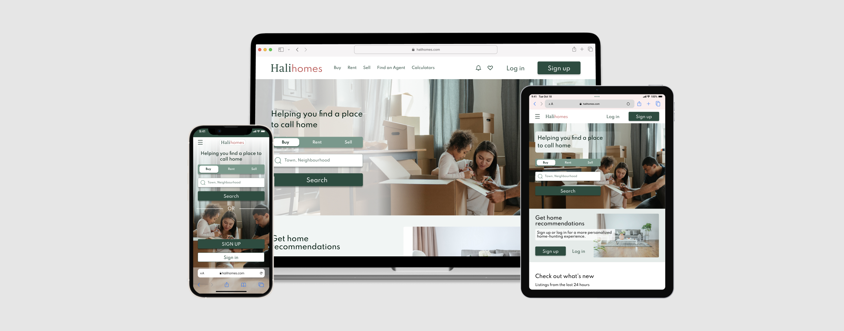
Halihomes
A responsive web app that provides property buyers with information on properties of interest.
For a brief overview of how the Halihomes UI came together, keep scrolling. To read the whole story, click here.
The Problem
Real estate investment is an increasingly popular way for individuals to achieve financial security. It is an exciting and emotional experience, and first-time homebuyers often find the process of purchasing a home overwhelming and stressful. They struggle to find relevant and accurate information about properties, neighborhoods, and the buying process, leading to confusion, indecision, and potentially costly mistakes.
The Goals
- A modern, responsive web app catered to new home-buyers
- Simple search functions with filter options that will immediately show users what they are looking for
recommendations based on previous searches/ profile - Content that will guide users through the process of buying a new home and provide detailed information about properties (visuals, specs, location, neighborhood etc.)
- A clean, uncluttered, simple design that will save users time
- Ability to contact real estate professionals to book viewings
The Process
The Solution
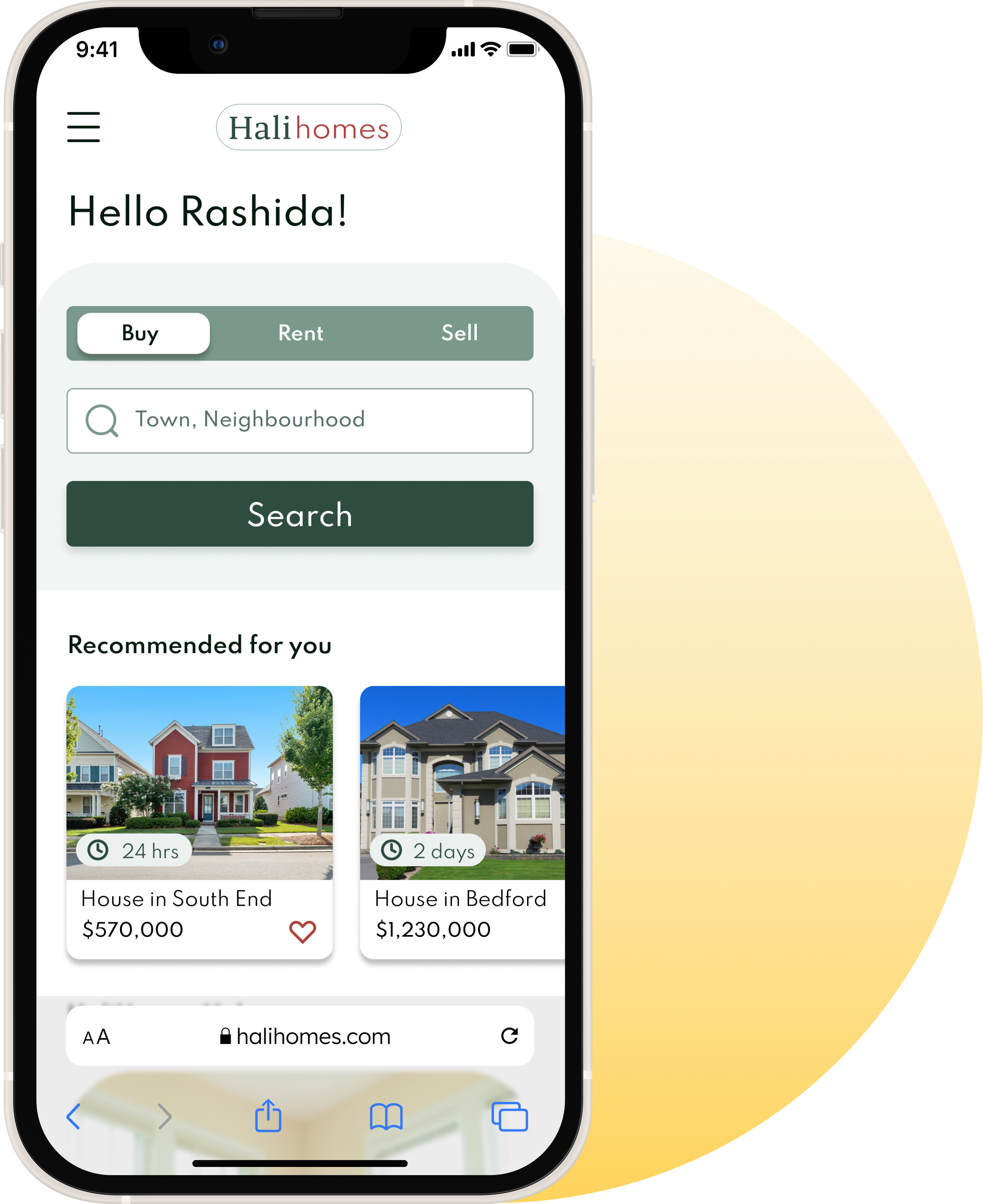
A responsive web app that aims to provide new home buyers with a platform on which to search for new homes that meet predetermined criteria, as well as learn the basics of home-buying and home-owning. Halihomes will provide them with the expertise needed to get started efficiently.
Getting started
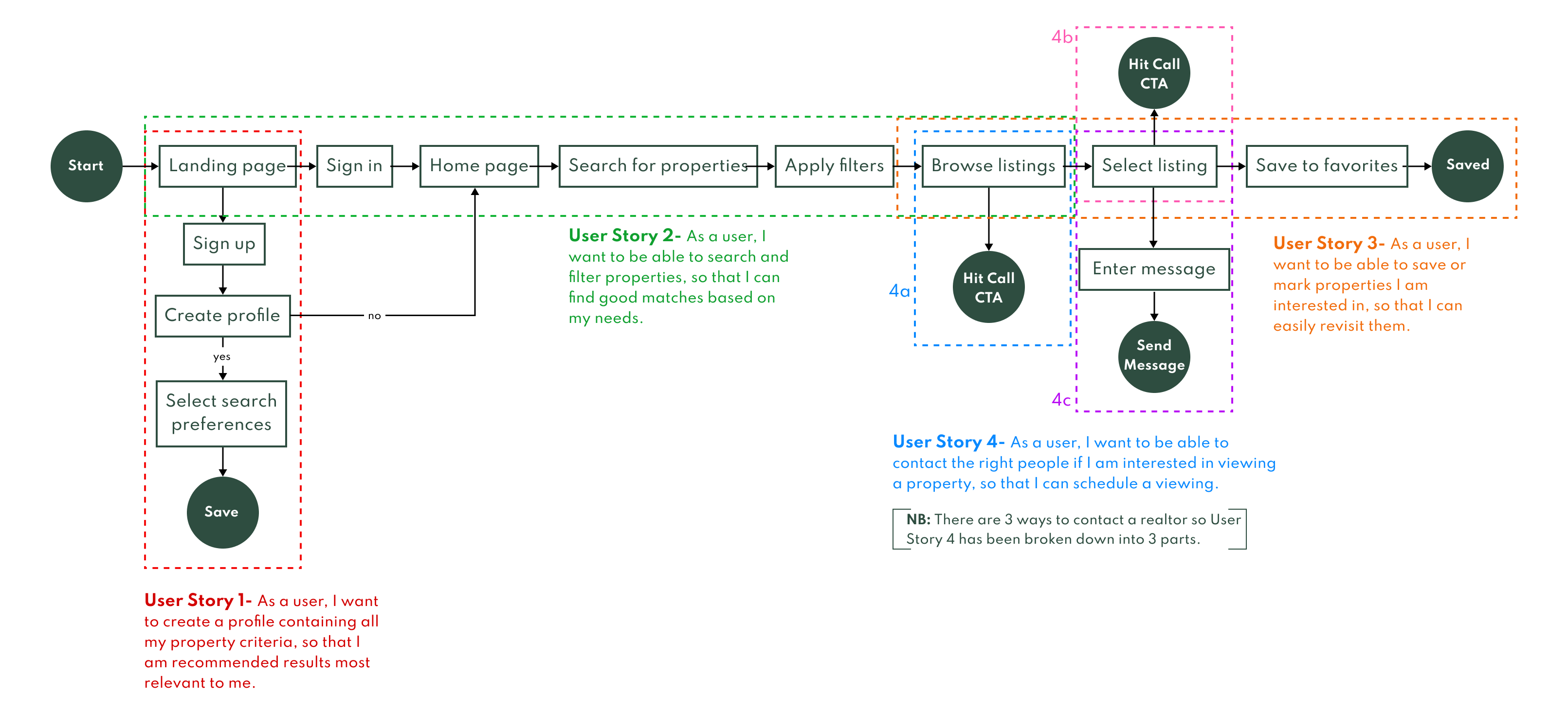
Given that the project was UI focused, I had already been provided with a user persona based on previously-conducted research. After acquainting myself with my persona, Rashida, I began mapping out the different actions she would take while using Halihomes to search for her new home.
User flows
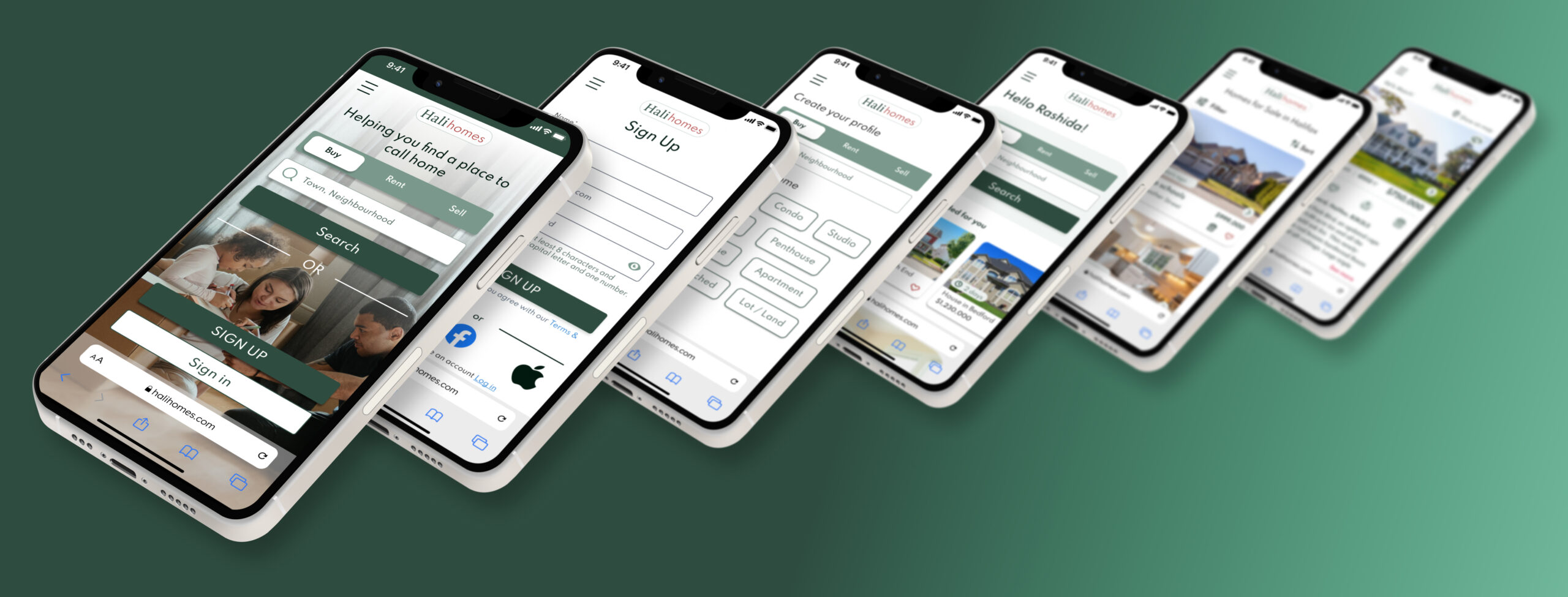
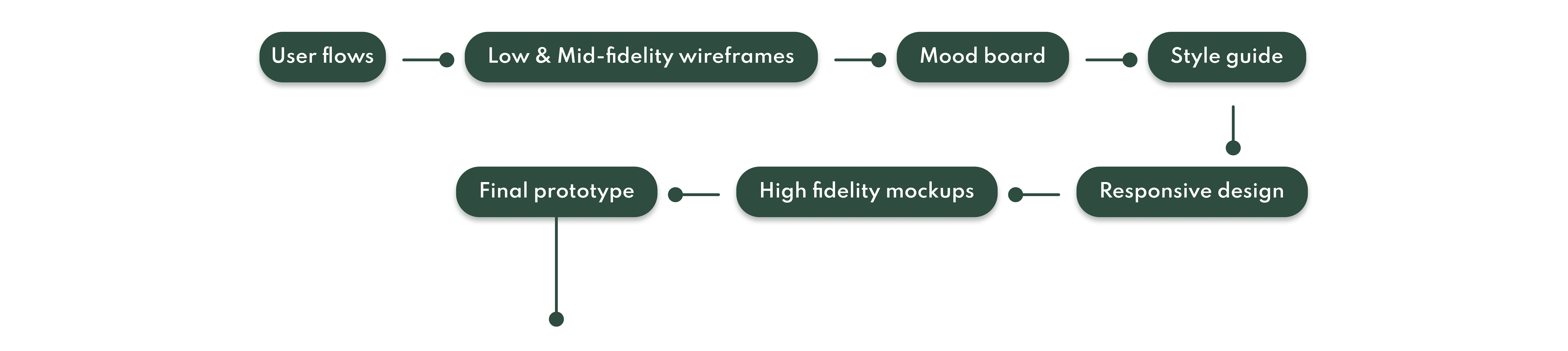
Building the framework
From here I was able to start rapid prototyping these flows on wireframes to then begin building mid-fidelity screens. These were iterated upon before I began the design of my high-fidelity screens. To see more iterations, click here.

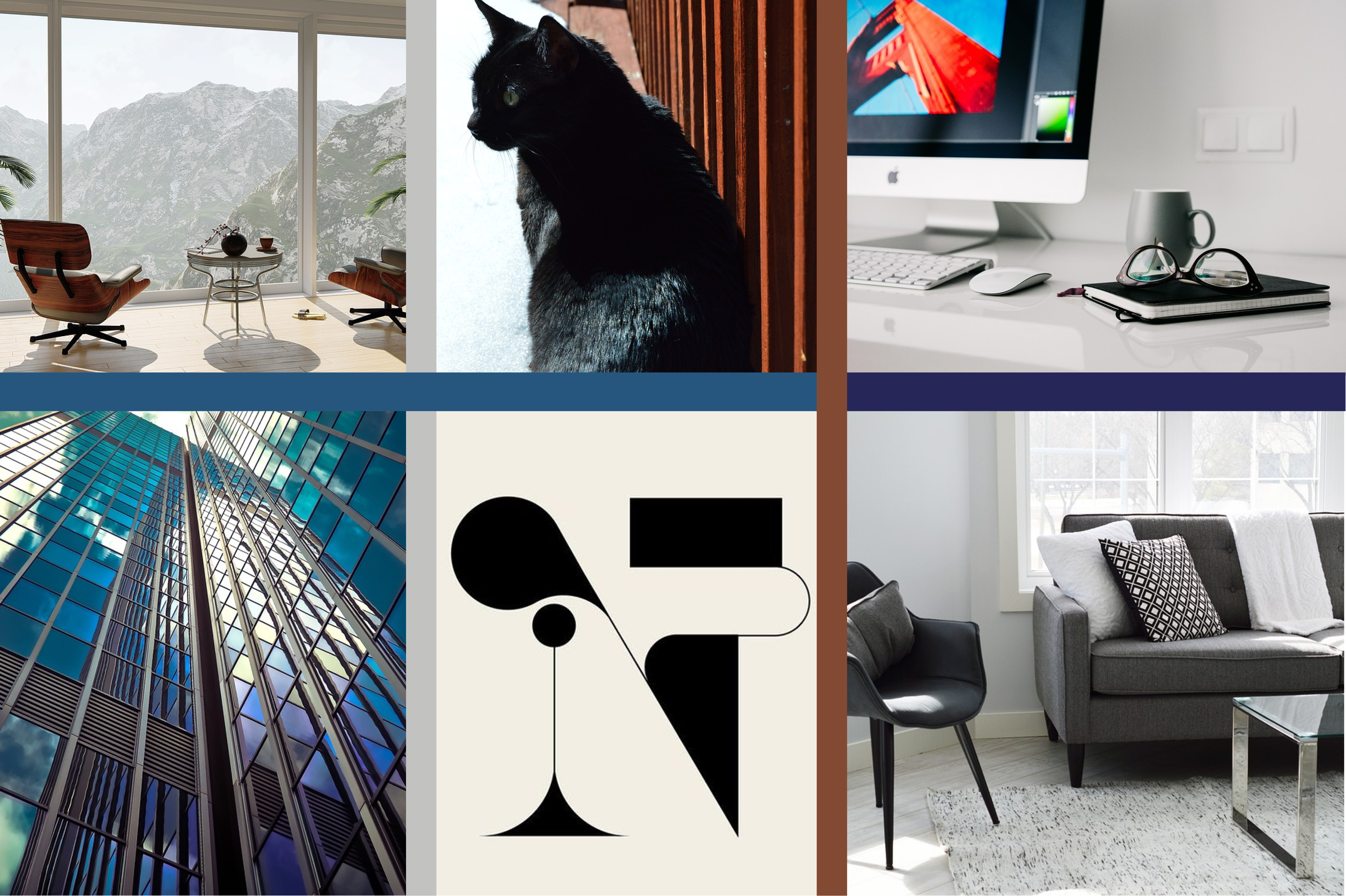
Guiding my visual design
I analyzed the research and extracted keywords to help me create two mood boards. These boards were quite different, the first having a crisper, more professional vibe, while the second focused on the feeling of family and home.
Mood board 1
Keywords: Technology / Quick / Comprehensive
Mood board 2

Keywords: Family / Uncomplicated / Countryside
Creating the visuals
I was now ready to begin building the pieces that would come together to make Halihomes. In order to maintain consistency and increase efficiency, I created a design system for Halihomes incorporating components and visual styles. Below is a sample of some of the elements I incorporated into my design system. For the full design system and case study, click here.
Halihomes Logo
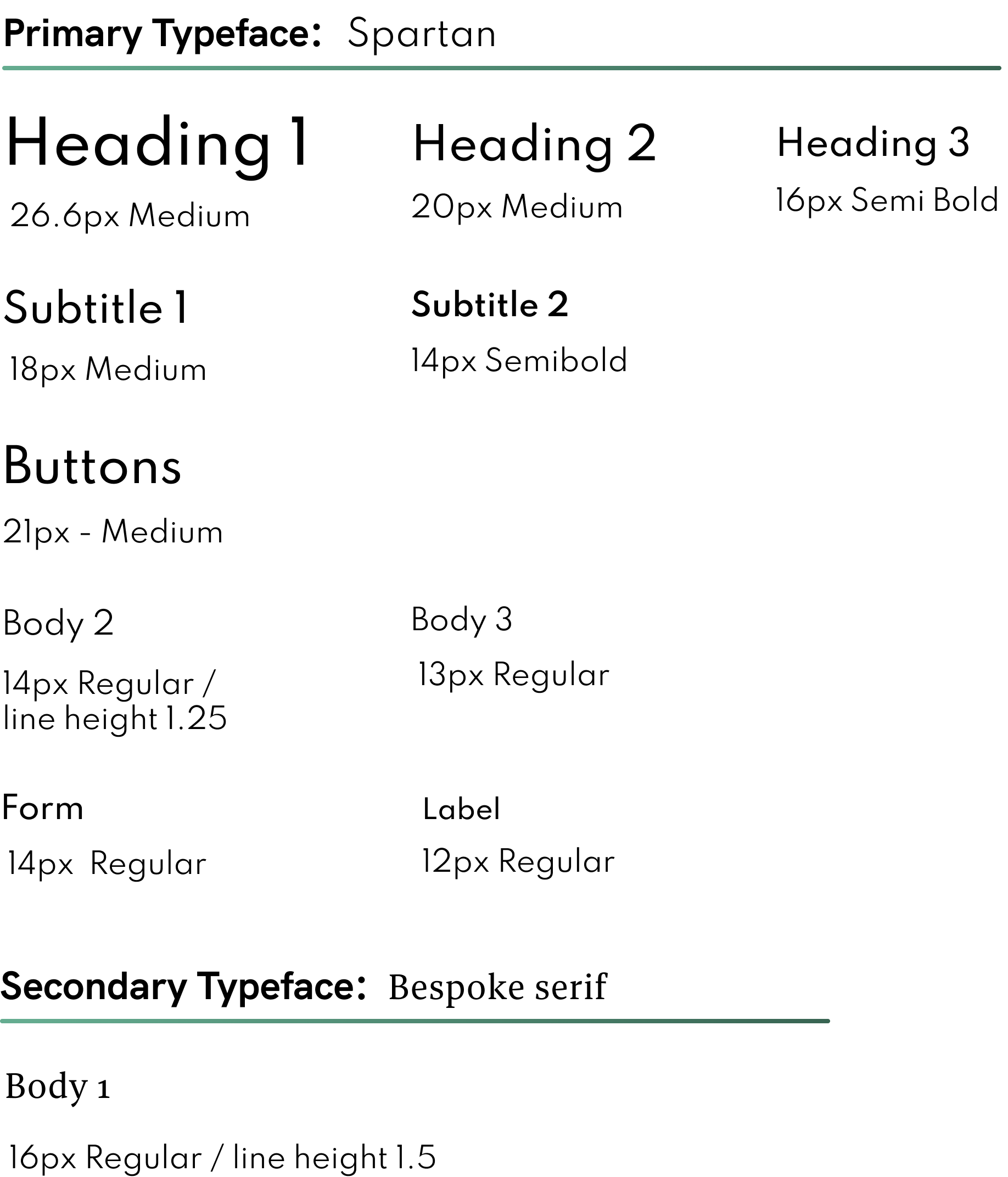
The Halihomes logo is consistent with the simple, straightforward design. A text only logo, it combines both app fonts, Bespoke serif and Spartan, as well as the two main colors #2E4D40 and #AE423F. The effect is a logo that is at once stately and welcoming.
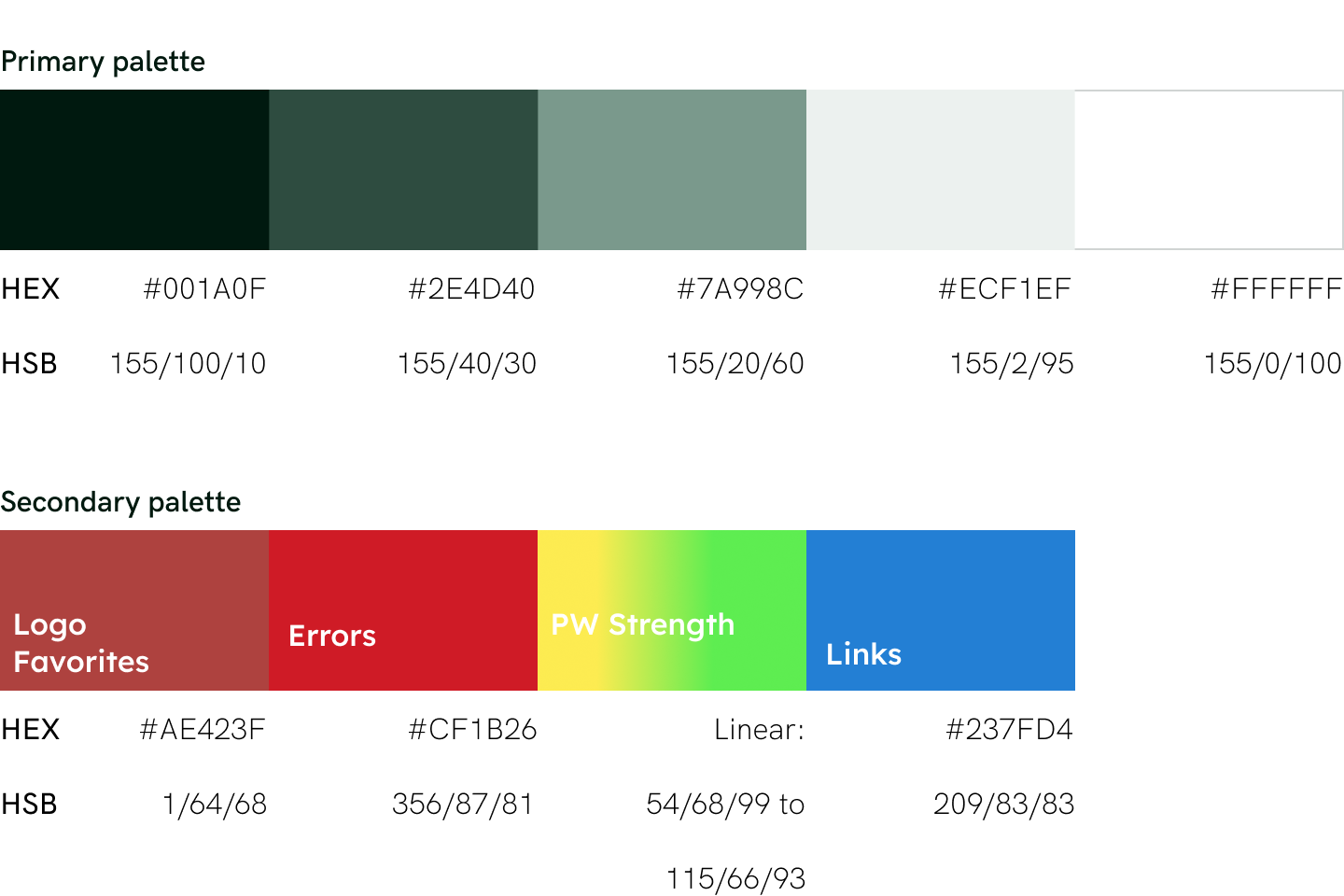
Color
I chose a deep green for my app in order to convey a feeling of abundance and harmony. I had played around with brighter, more attention-grabbing colors, however, I wanted the focal point to be the images. Therefore I opted for a strong color that would support the images rather than steal the show.
Typography
For the main copy, I wanted a clean, simple typeface that would not take away from the imagery. However, for longer property descriptions I chose a serif font for readability.
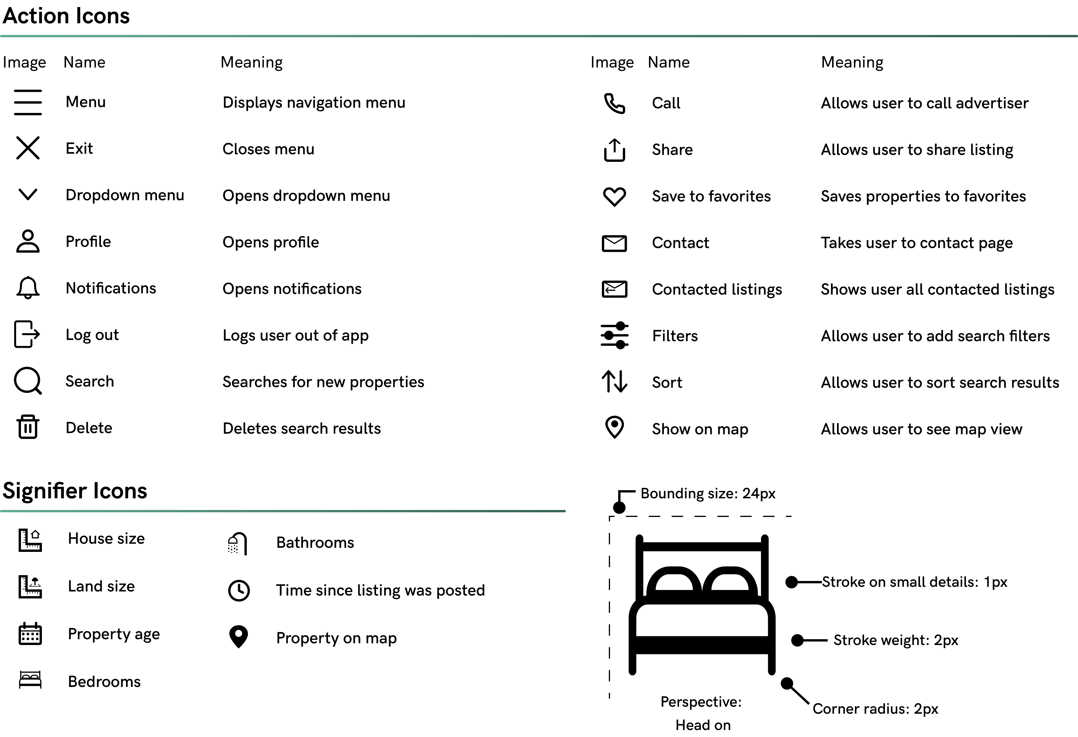
Iconography
Icons are simple, clean but friendly with a light stroke weight of 2px and slight rounding of 2px to match.
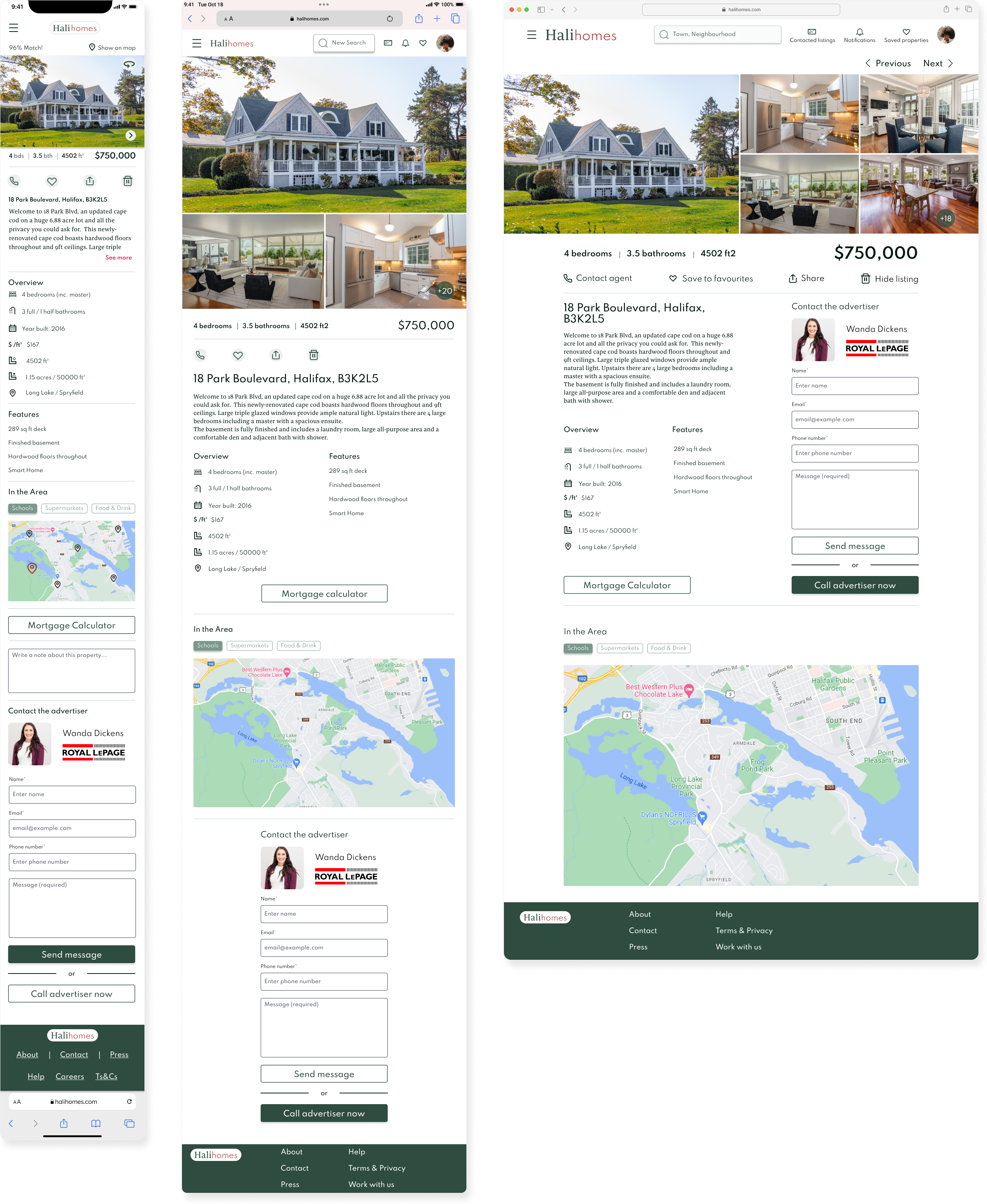
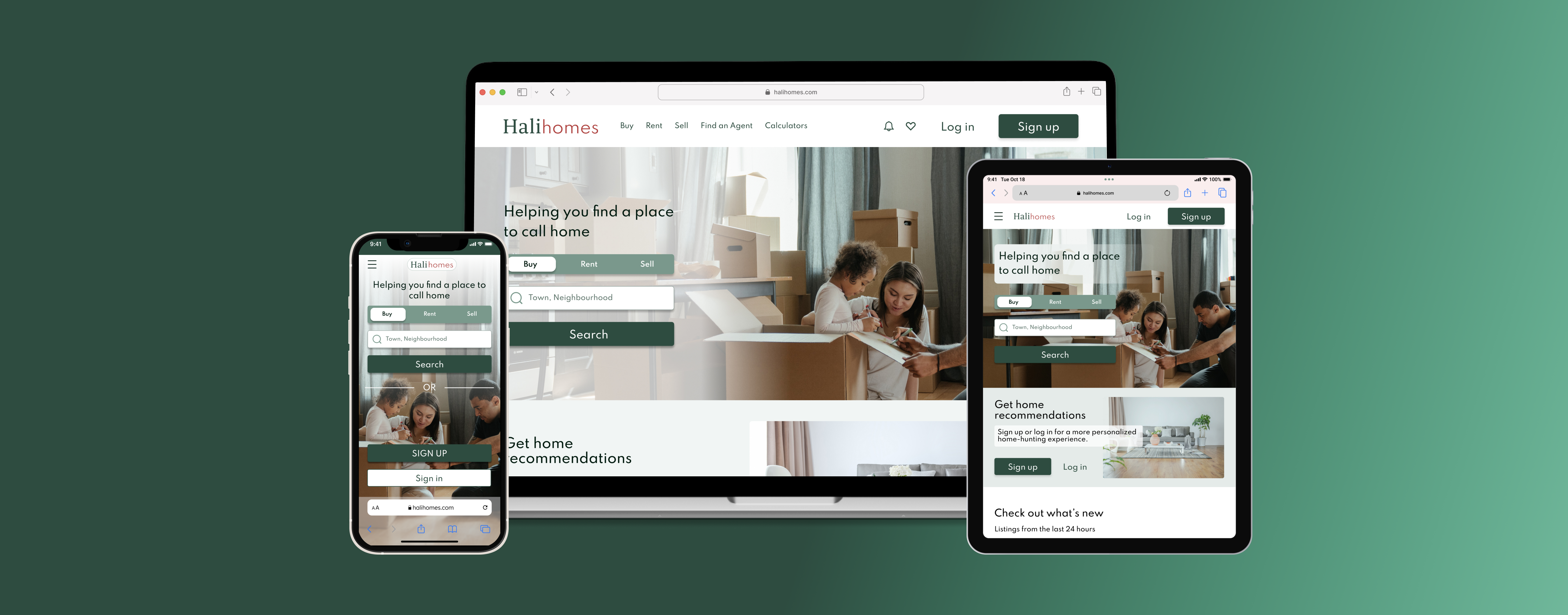
Designing across devices
In order to make my mobile screens responsive, I developed a grid system for both tablet and desktop, choosing breakpoints for each. Key for me was maintaining the clean, simple look. Therefore, I made whitespace my main priority.
Interact with the Halihomes prototype below
Selected Works