Chef Space
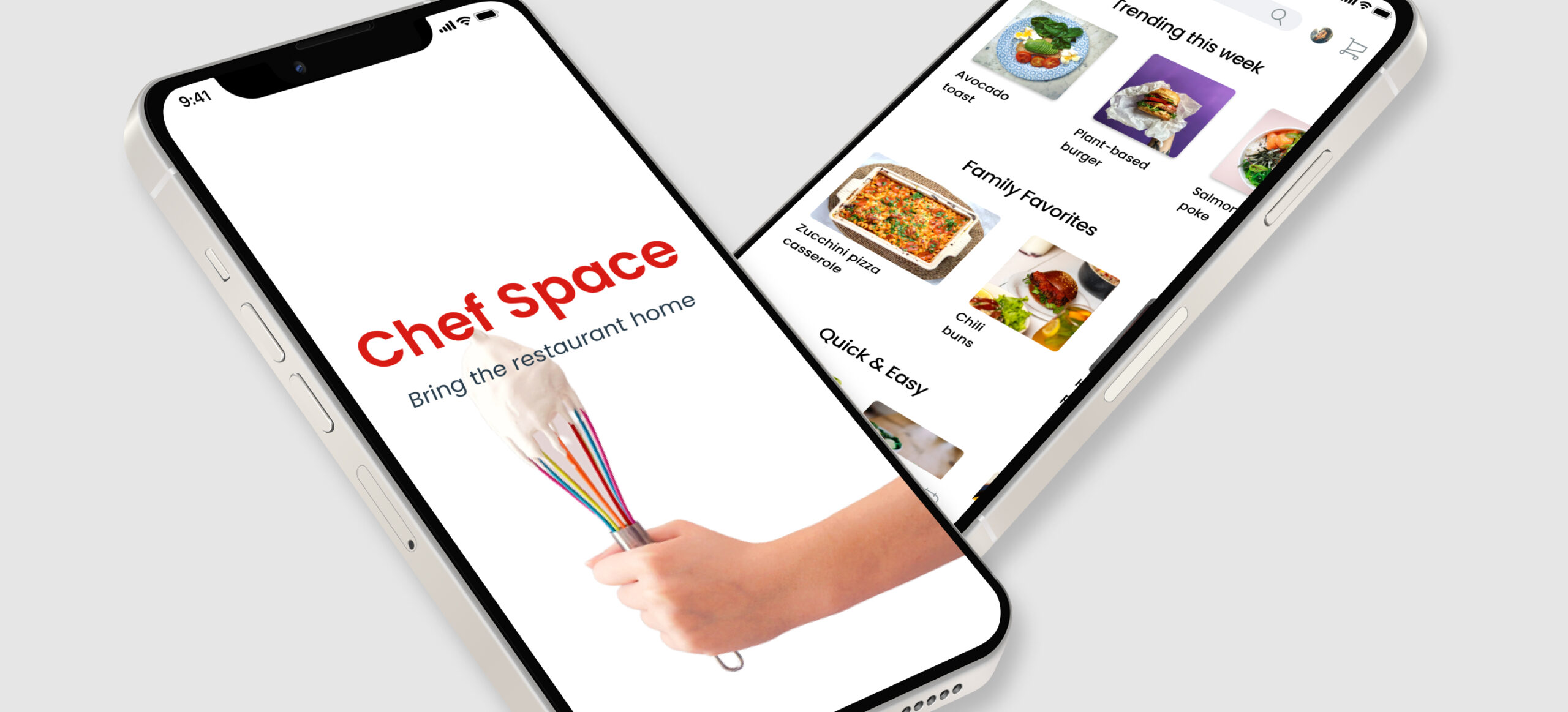
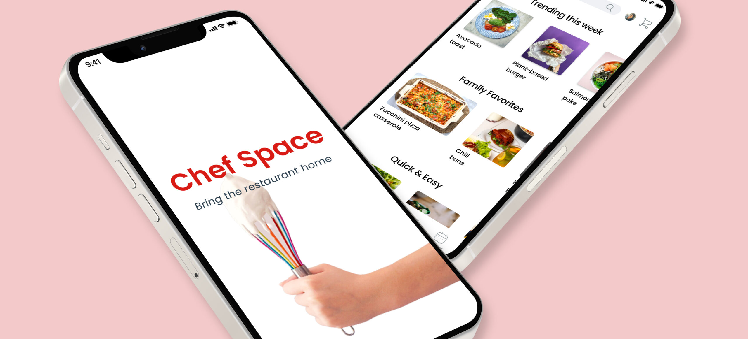
A mobile app that enables users to book classes with professional chefs.
For a quick overview of Chef Space, scroll down. If you have the time, and would like to read about the journey from conception to completion, click here.
The Problem
Beginners and cooking enthusiasts alike often struggle to find convenient and affordable ways to improve their culinary skills. While there are countless cooking resources online, it can be difficult to find high-quality instruction that is tailored to individual needs and preferences. Many users are also hesitant to pay for private cooking lessons due to the high cost and limited availability.
The Solution
Chef Space aims to solve this problem by offering a platform that connects users with experienced chefs for personalized, one-on-one cooking lessons.
My Process

Research first
I began by conducting benchmarking and competitor analyses to understand what was already available to users. Then I got started interviewing potential users to see what difficulties they faced when trying to improve their cooking skills. Here are some of the key insights from my interviews:
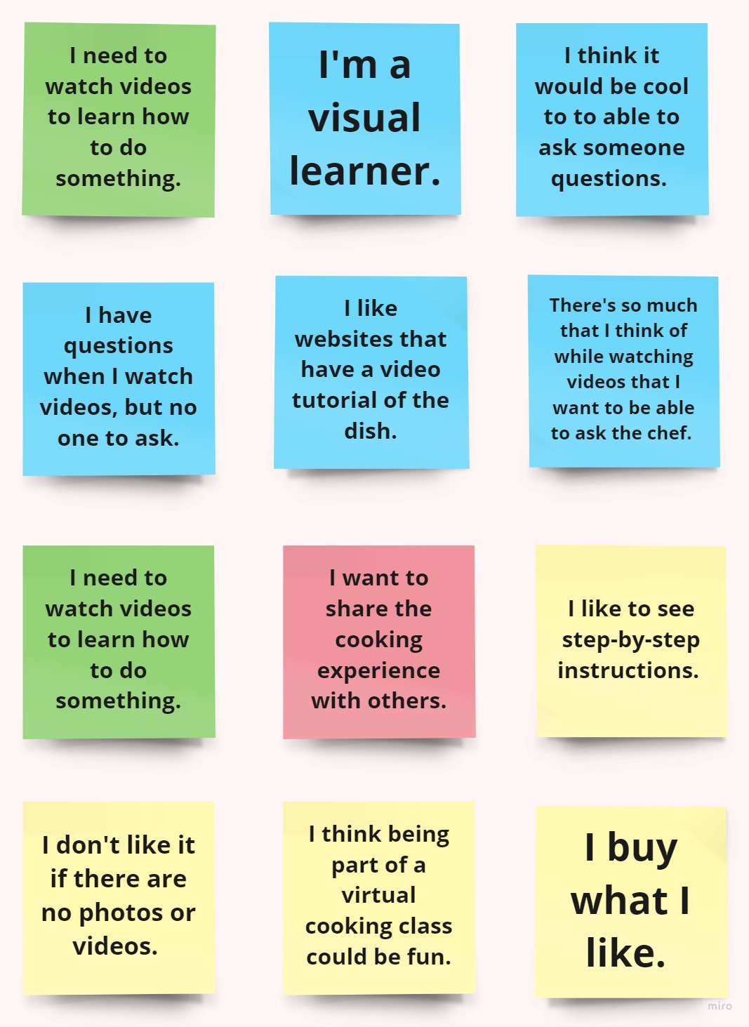
- People enjoy cooking at home and do it quite often.
- People said they haven’t actively tried to improve their cooking skills but also said they use apps/websites and videos to help them.
- The feature people liked the most about their current cooking apps was the video feature. People appreciate a visual when trying to make new recipes.
- The majority of people said they were interested in the idea of connecting with a chef to improve their cooking skills
My muses
After compiling the information from the interviews into affinity maps, I used this data to begin envisioning user personas whose needs would guide my design decisions moving forward.


User flows


Turning data into visuals
These flows became a detailed site map from which I conducted a hybrid card sort to help me understand the different ways people interpret and organize data. My site map and was now ready to begin sketching wire-frames which would become the first visual representation of Chef Space.

These wireframes represent the flow that allows a user to save a recipe to favorites.
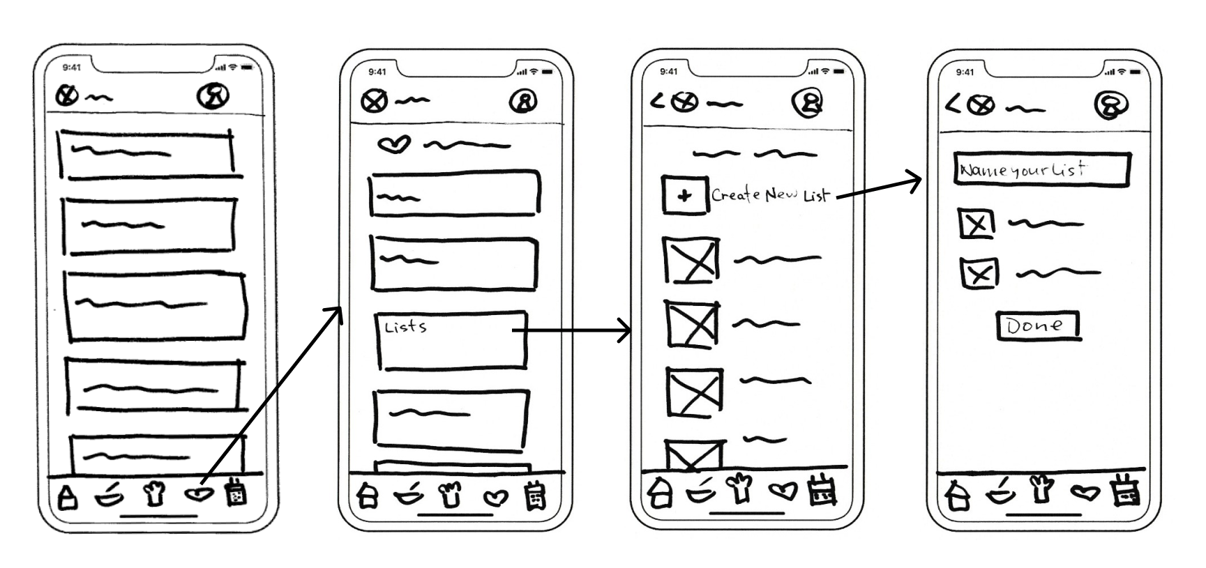
In a separate flow, users can create new lists in which to save their favorites.
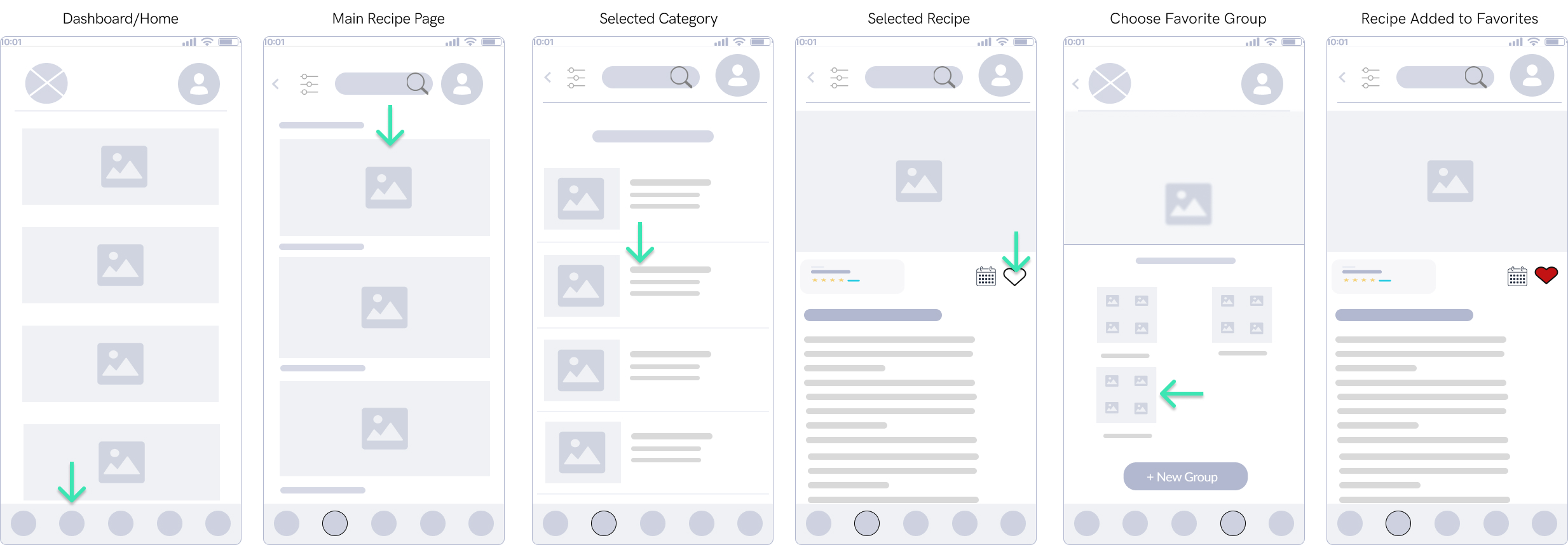
Based on the feedback I received, I decided to simplify and combine these two flows, allowing the user to create new collections while saving a recipe. The result was a more streamlined, intuitive experience overall.
Testing and analyzing
Mid-fidelity prototype complete, I set off to test it out on six volunteers. I assigned tasks for them to complete and watched them as they navigated their way through baby Chef Space. I was especially keen to see how they fared when trying to book a class with a chef, as this was the key selling point of my app.
The Results
With the data from my usability tests, I created another affinity map, this time dividing the results into the following categories:

More iterations
I decided to prioritize finding solutions to deal with the most urgent errors and allow the less urgent ones to be fixed by those solutions. Issues that needed immediate attention were making sure the purpose of the app was clear to users and improving the class booking process.
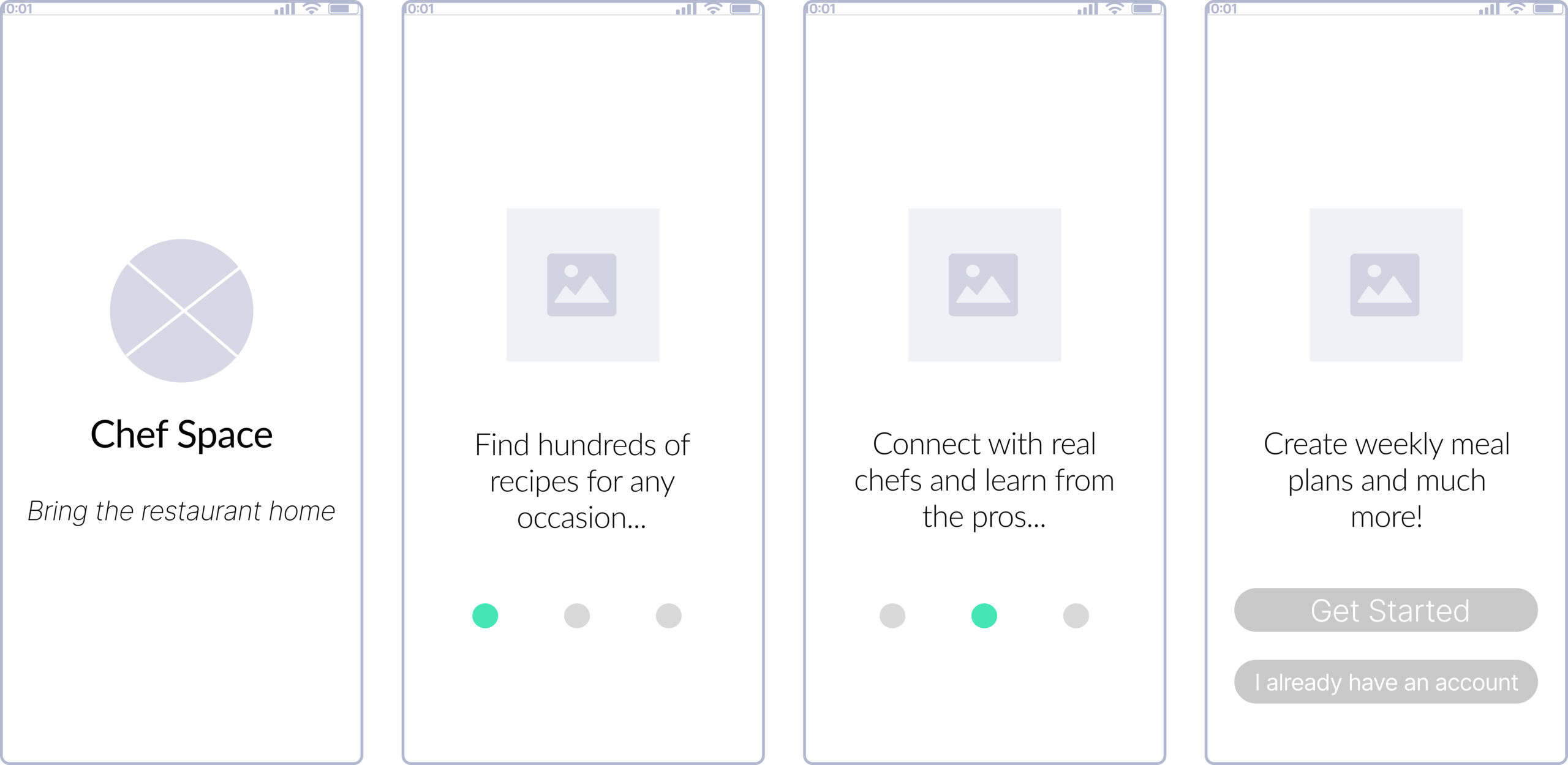
Initial intro screens were vague and didn't give a clear idea of the purpose of the app.
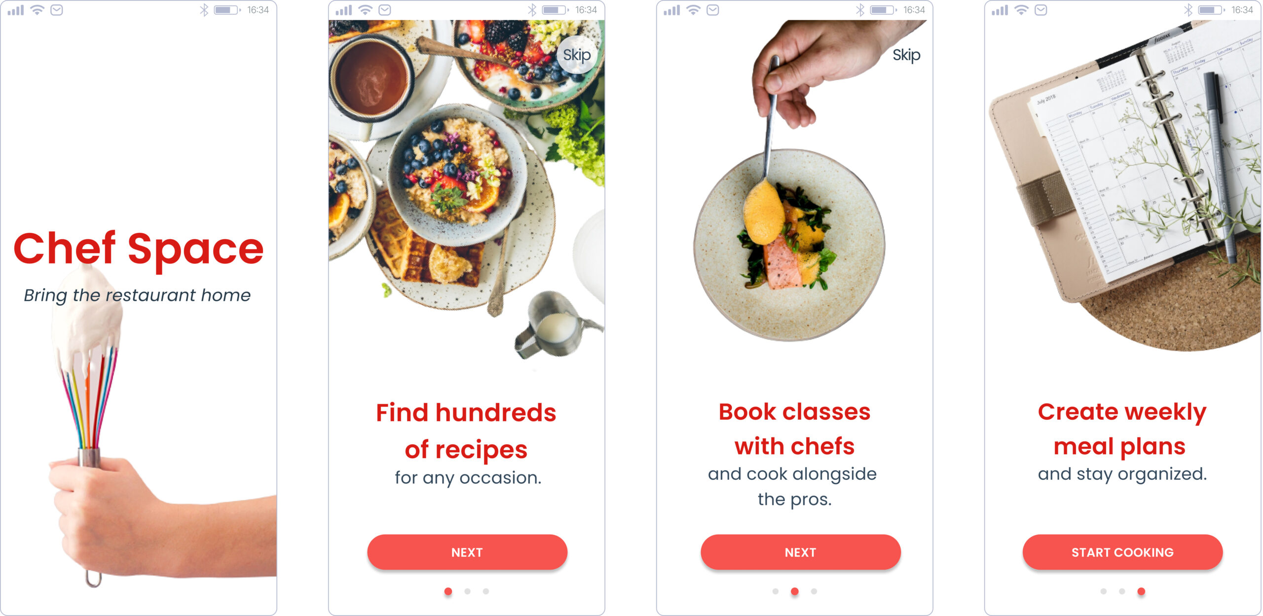
I updated the copy to include the words "Book classes with chefs" to ensure users knew what they could do with Chef Space.
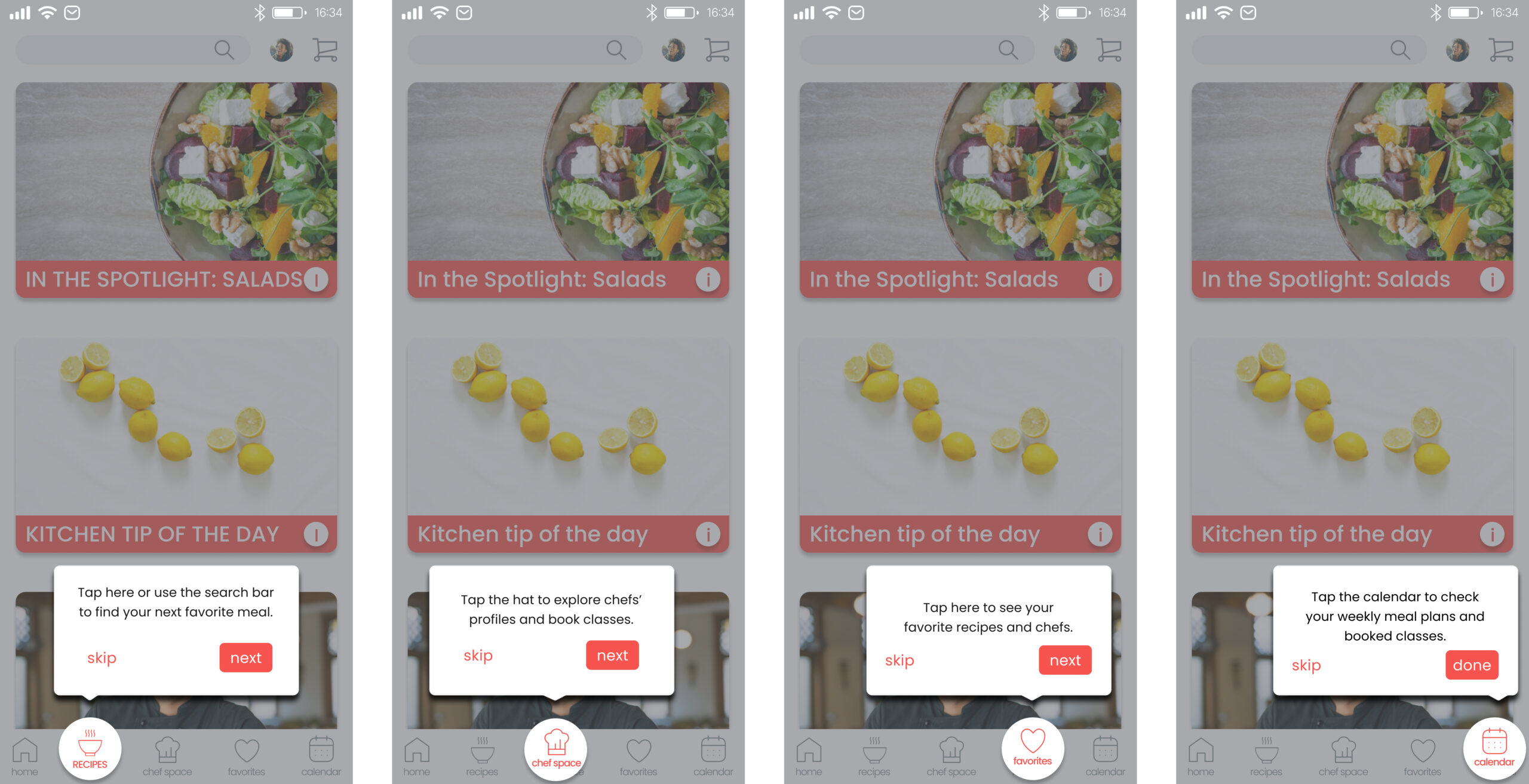
After sign up, onboarding screens were added to guide users through the various sections of the Chef Space.
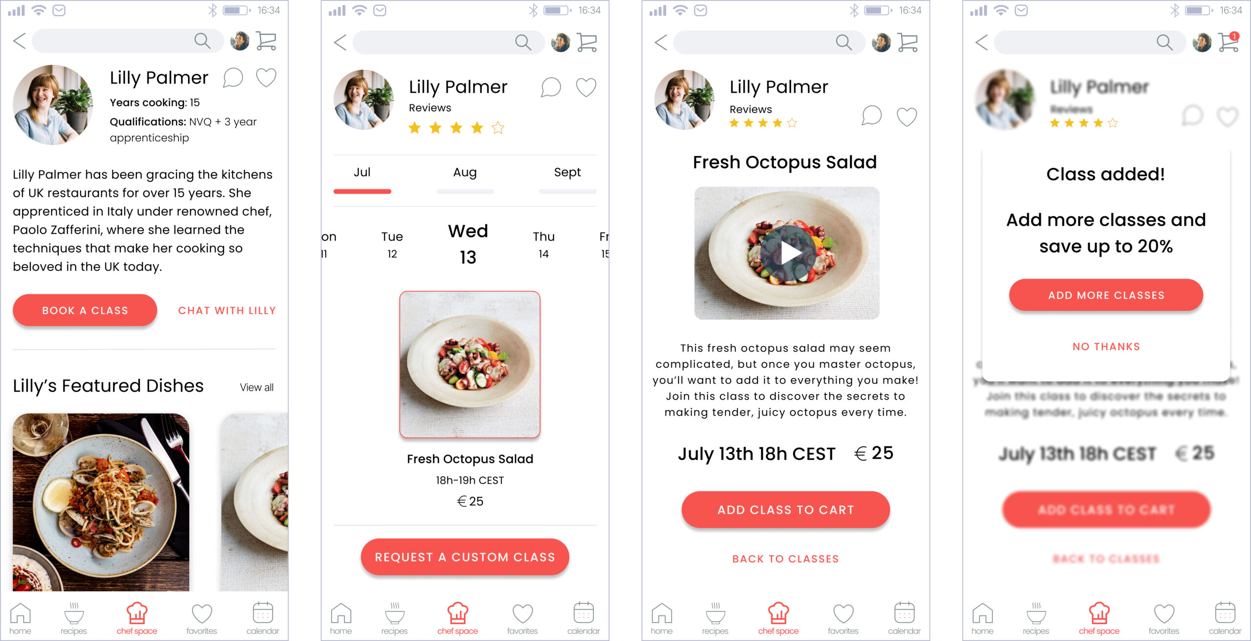
After guiding the user to the "Chef Space" in the onboarding, I ensured the booking process was simple by including a CTA button on the chef's profile.
Final mockups
Sign up
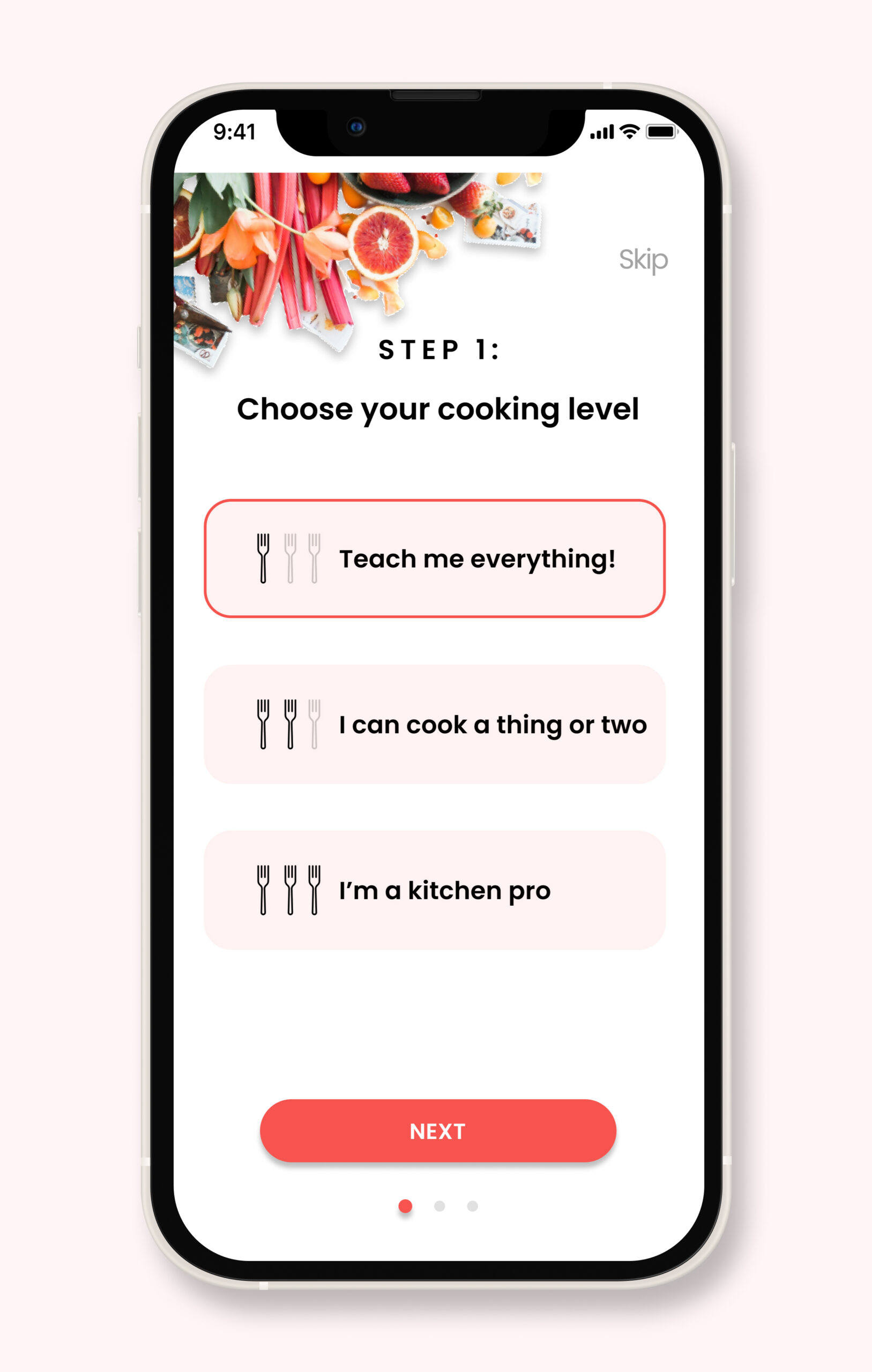
Choose cooking level
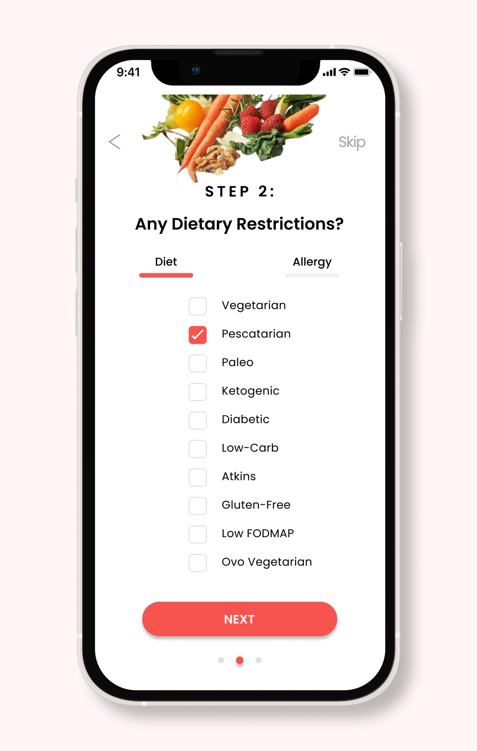
Select dietary restrictions

Select foods from dropdown menu
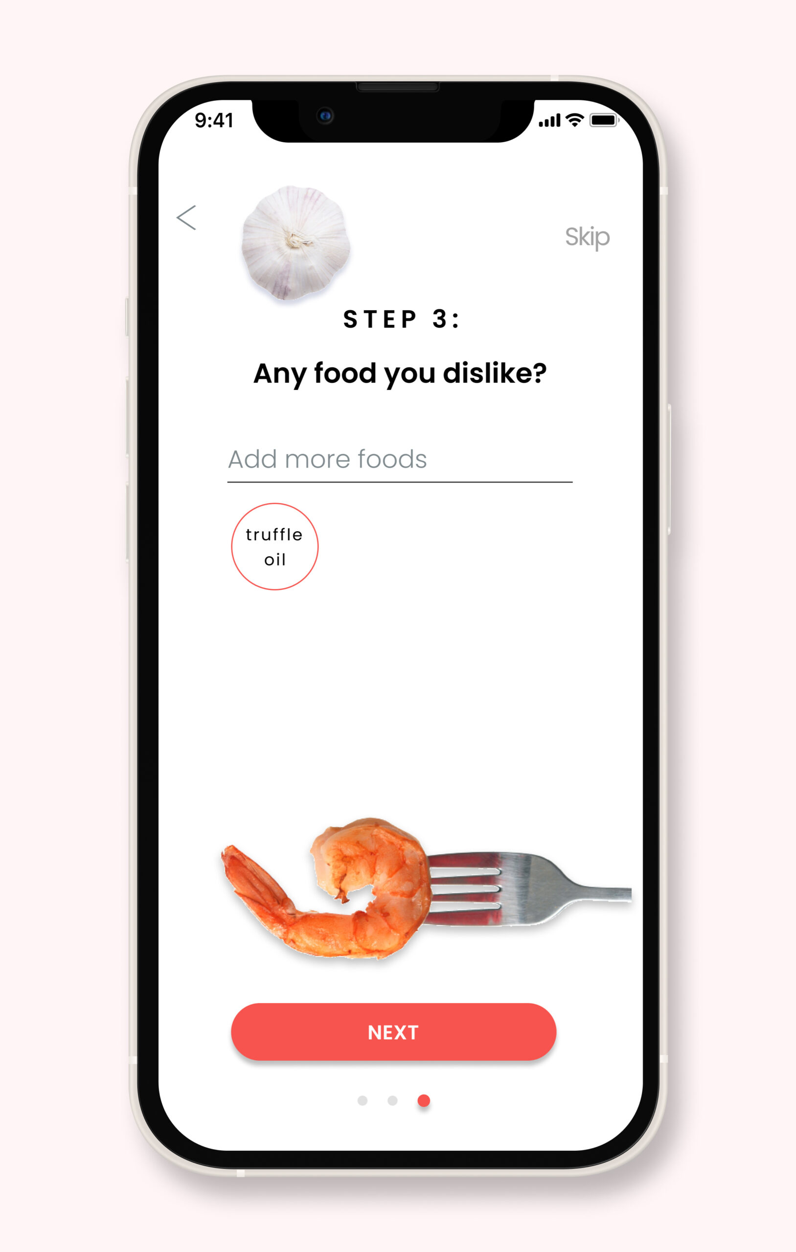
Add disliked foods
Users can set preferences such as level, dietary restrictions, allergies and disliked foods in order to have a completely personal experience and see only recipes relevant to them.
Find a chef
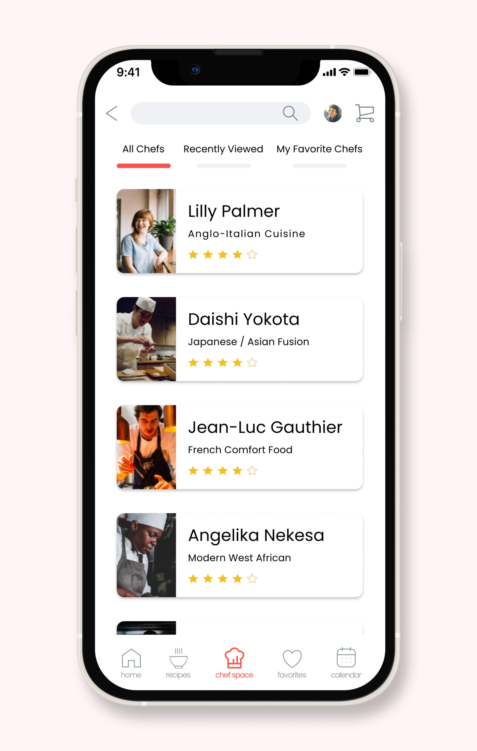
Browse chefs

Chef's profile
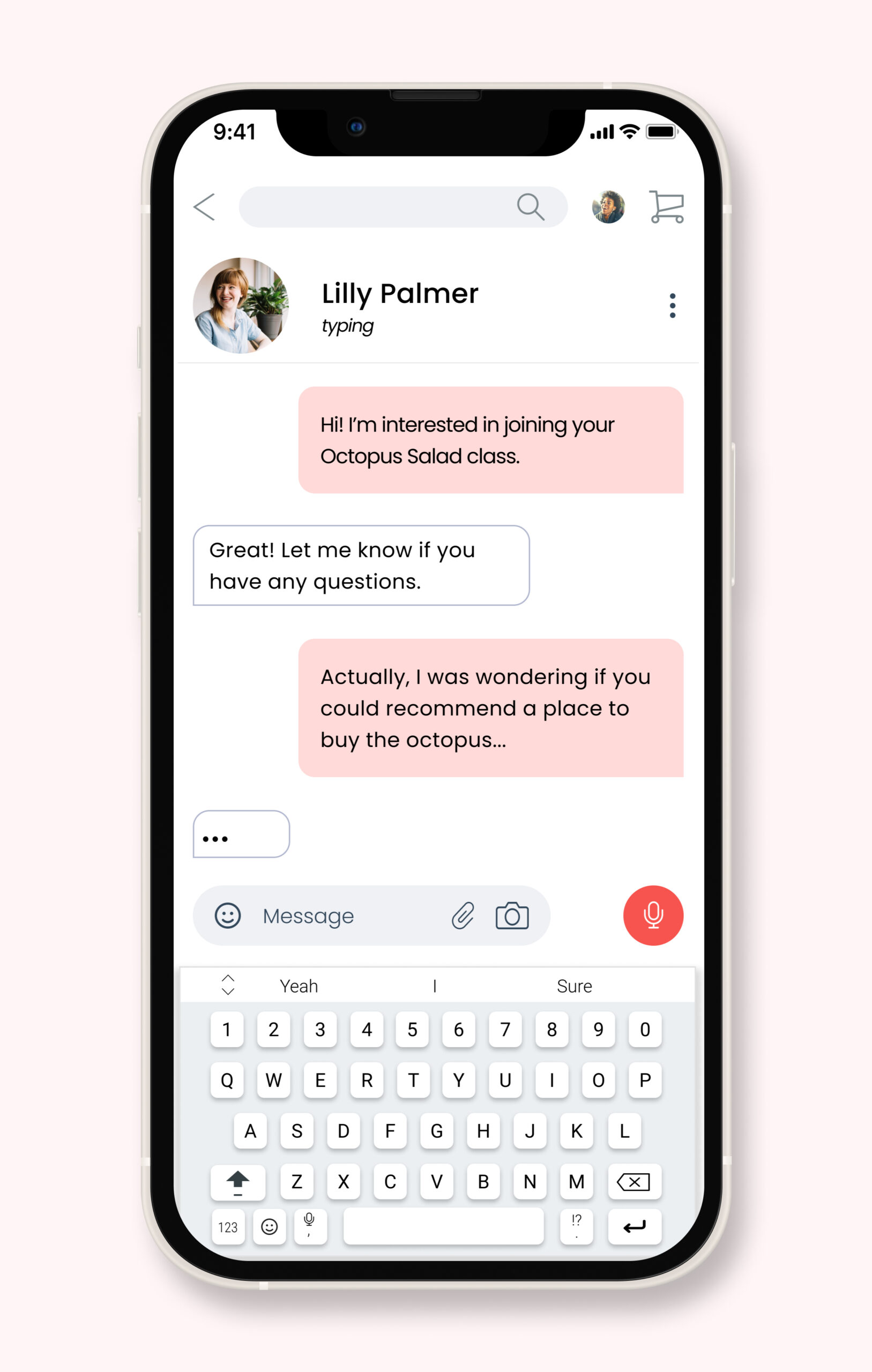
Chat with a chef
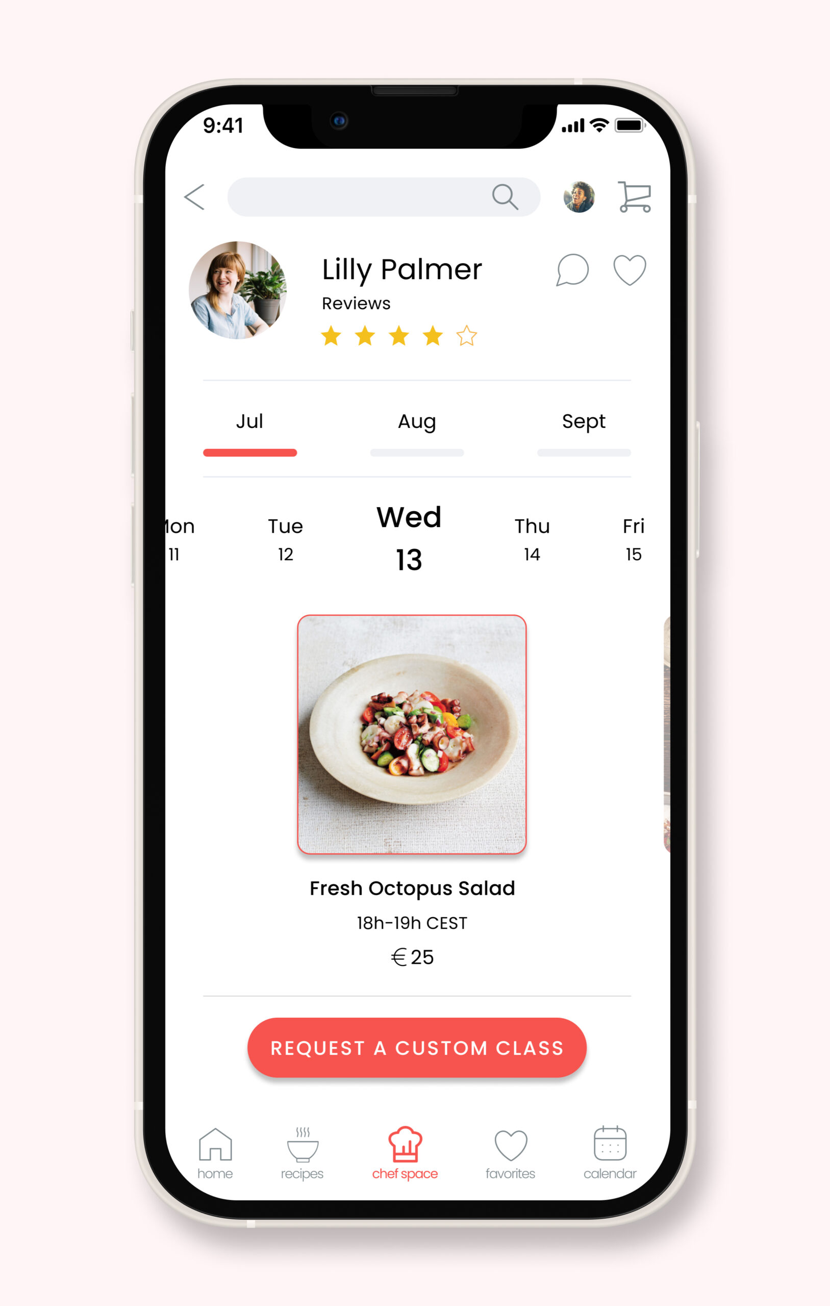
Book classes by the day
In the “Chef Space” users can browse chefs to find one they like, then open the chef’s profile to see more information. From here they can start a chat with the chef and book a class to learn how to cook that chef’s dishes.
Save a recipe to a collection
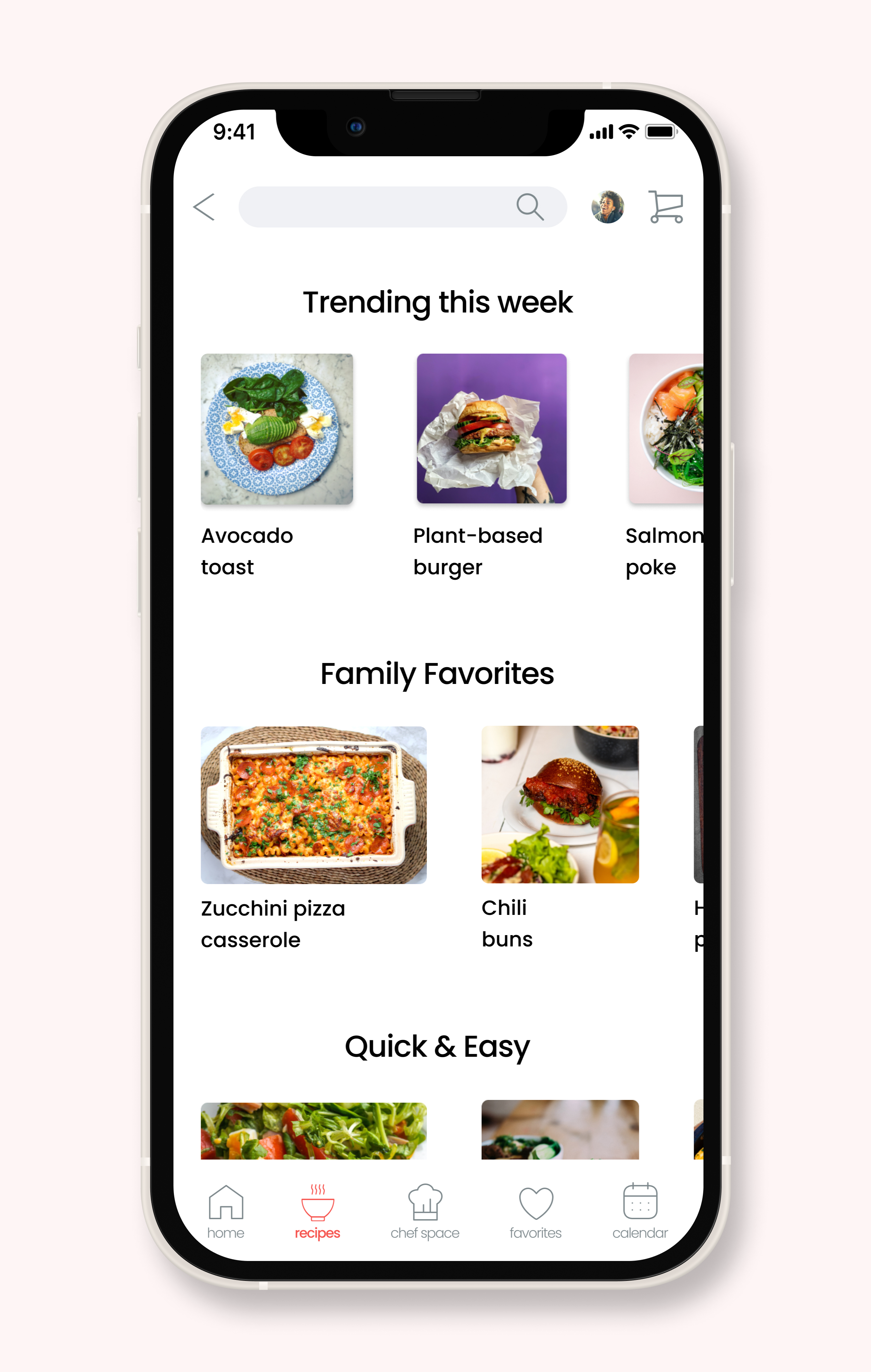
Recipes screen

Selected recipe
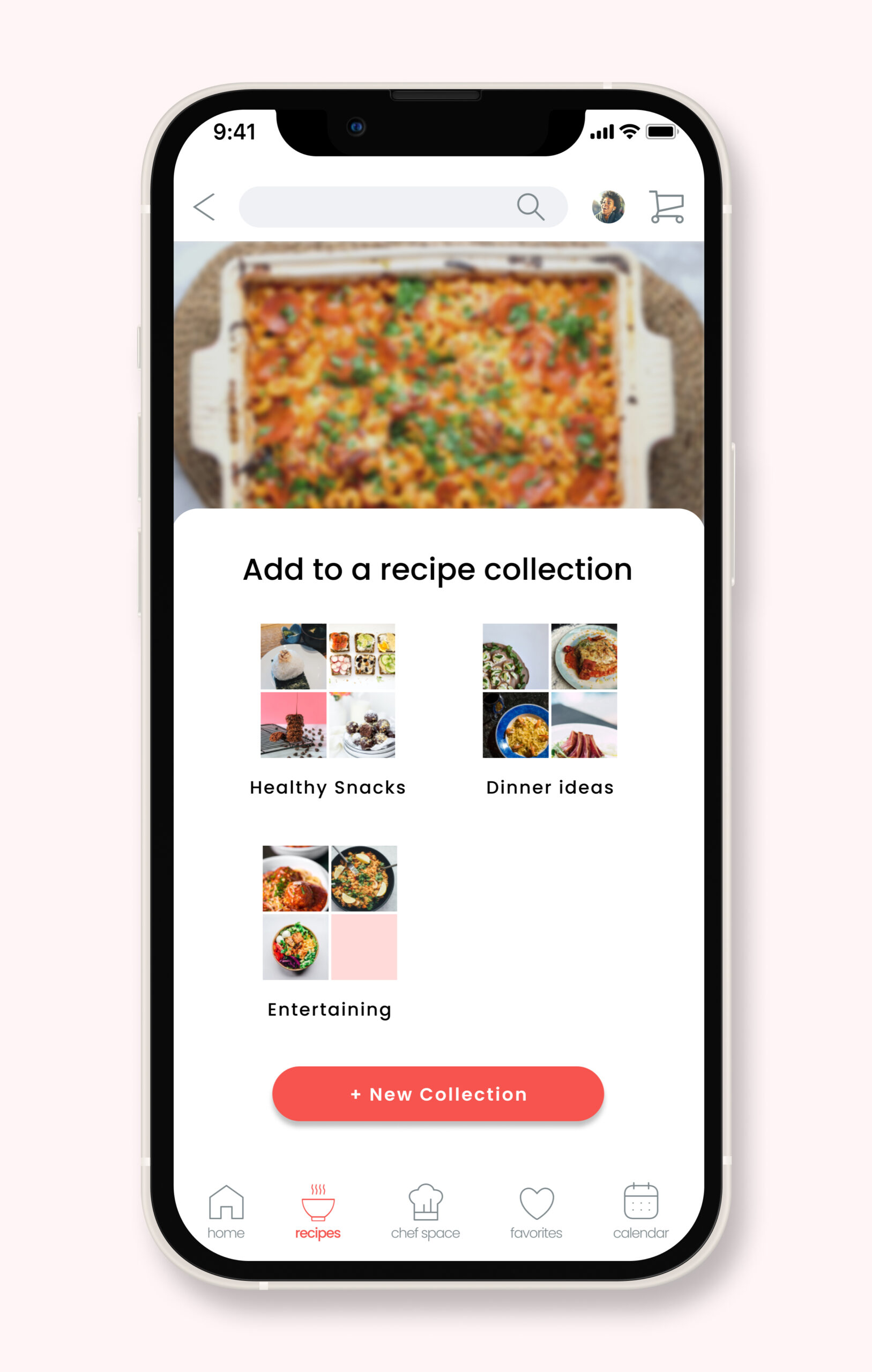
Save recipe and add to a collection

Recipe added success modal
Chef Space also works as a recipe app, in that users can browse recipes and save them to collections to be viewed at a later time. Users can create as many collections as they like.
Interact with the Chef Space prototype below
Selected Works
